|
Reflections 2025
Series 6
August 4
Academia III: Brooklyn Tech II: Print Shop: Letterpress – Gutenberg & Bible - Latin Alphabet – Minuscules – Printing Machines
| | We left off with my great satisfaction with Brooklyn Tech's College Prep course where I was not pressed to take one of the eight engineering majors but was instead exposed to two panoplies of challenging courses, still leaving me open to become a language major in college. One was all the academics, such as math, physics, English, history and more (we'll get to German in a moment). The other, surprisingly, was the series of engineering and shop courses, some perhaps already getting outdated at the time, but fun nonetheless. These included Industrial Processes, Technical Drawing (T-squares! Triangles!), Sheet Metal Shop, Machine shop (belts to the ceiling!) and Foundry (Sand Casting!). These are mostly crafts that have come down thru the ages that are quickly either dying out or being replaced, but there's no way I would have otherwise been exposed to this variety of hands-on, apron-and-goggles activities. I enjoyed it and miss it. | | | | Print Shop The only one I have not yet discussed was my favorite, Print Shop. Just as in Junior High I loved touch typing, which I now see is because it's tactilely working with language, for that very same reason I loved Print Shop—even more. I see in the old Tech handbook it was officially called Printing Technology. Ok, that sounds even better.
Most precisely, it was letterpress typesetting. Letterpress simply means applying ink to a series of metal LETTERs, then PRESSing paper to the surface to transfer the image. Simple enough. But it's the manual typesetting part that's the most fun—that's the process of assembling all those metal letters of type. After that, running them thru the printing press, while also fun, was for me secondary.
Let's cut right to the chase, then go more into detail. This drawer is called a type case--remember that second word--and each cubbyhole contains numerous copies of a single letter (Photo by Willi Heidelbach). They are set, one-by-one into the composing stick you see (adjustable for length) to create lines of text. Blanks for spaces are included in the case, as well as a piece of metal to separate the next line. You will see that the typesetter works upside down with the backward pieces of type.
| | | | | | How good are you at working upside down and backwards? Can you read the text? It starts out with the classic phrase "The quick brown fox jumps over the lazy dog", which famously uses all the letters of the alphabet. |
| | | | If you wish to see it done letter by letter, watch this video (2:35) showing a Type Case and Typesetting in a Composing Stick.
Removed from the composing stick, the text joined together with other lines on a galley, inserted into the printer, inked and pressed onto paper to create an impression in the actual printing machine. This method is a vastly older craft than later printing, and, tho long outdated, is still valued for its craftsmanship, artistry, and unique tactile quality.
Letterpress printing was the normal form of printing text from its invention by Johannes Gutenberg in the 1450s thru the 19C, and remained in wide use until the second half of the 20C, so our work in the late 1950s was at the very tail end of a long history. But it's a craft, and more recently, letterpress printing has seen a revival in an artisanal form.
| | | | Pre-Gutenberg The Gutenberg revolution was comparable to the present computer revolution. It's hard to imagine the world at the time. Writing existed in the form of manuscripts, and only the clergy, plus some wealthy people, could read. Common people resorted to pictures. A shoemaker's shop hung a sign of a boot outside, a dentist's office a tooth. If you were to meet someone at the Red Lion pub (Photo by Jrcla2), that's what you looked for and skipped the Castle pub with its pictorial sign. Today these are purely decorative. Then they served an actual need.
If you needed a document, you went to the scribe in the market place, sitting between the apples and the steaks. You dictated to him as you would to a secretary what you needed. If it was a legal document, you proceeded accordingly. If it was a letter, you sent it by courier, and the recipient took it to his own scribe to have it read back to him. People going to church actually learned from the murals, paintings, and statues, and the sermons were teaching sessions of Bible stories for an illiterate congregation.
If you define printing as carving a picture in a wooden block, rolling ink over it, and pressing paper on it to copy the image, that had existed since about 800 CE in China. Even movable type first appeared four centuries before Gutenberg, also in China. The world's first movable type printing technology was made of porcelain type and was invented around 1040 CE in China during the Song dynasty. In 1193, a book in the Song dynasty documented how to use the copper movable type. The oldest extant book printed with movable metal type was printed in Korea in 1377. Why didn't that technology spread around the world?
One factor was some of that early type being made out of porcelain, which would have been cumbersome to deal with. Another factor was writing systems. The Chinese porcelain type came to some 3,500 characters. A similar innovation of type in Korea came to some 1,400 characters. But in Europe, the small number of alphabetic characters needed for European languages made all the difference.
| | | | Gutenberg Johannes Gutenberg, a goldsmith, began experimenting with printing in Strassburg in 1440, and by 1450, he had a working printing press in Mainz (I hope you're rhyming that with "pints"). His most famous work, the Gutenberg Bible, was completed by 1455. His contributions are two major ones, the printing press itself and, to me much more importantly, movable type as we saw above.
Gutenberg's invention of movable type was rated by Time magazine as one of the most important developments of the millennium, referred to as the Printing Revolution. Prior to his invention, ordinary people could not afford to own a book. With the efficiencies created by Gutenberg, printing costs dropped dramatically, and book ownership became common in Europe. People could now buy their own Bible, and interpret it themselves, rather than have to rely exclusively on the clergy. This led to people thinking for themselves as well, which led to the Protestant Reformation and the Enlightenment. A single Renaissance movable-type printing press could produce up to 3,600 pages per workday, compared to forty by hand-printing and a very few by hand-copying. From Mainz, the movable-type printing press spread within several decades to over 200 cities in a dozen European countries. By 1500, printing presses in operation throughout Western Europe had already produced more than 20 million volumes.
This form of presswork gradually replaced the hand-copied manuscripts of scribes and illuminators as the most prevalent form of printing. Printers' workshops, previously unknown in Europe before the mid-15C, were found in every important metropolis by 1500.
Tho I've seen the word in the past, I have just now learned the meaning of "incunabula", and it fits right into our topic. An incunabulum is an early printed book from the 1400s, from Gutenberg's time to the end of the century in 1500. It's distinct from the manuscripts, written by hand, that were prevalent at the time. The word is based on the Latin word for cradle; in Spanish, "cradle" is cuna. Now let's look at this (Map by NordNordWest):
https://upload.wikimedia.org/wikipedia/commons/thumb/5/59/Printing_towns_incunabula.svg/960px-Printing_towns_incunabula.svg.png
These are printing towns across Europe (click) that produced incunabula in that period, showing the spread of printing in the 1400s. 271 locations are known, the largest are named. The colors go by the five decades in that earliest half-century printing period. The only ones in black are Mainz, as well as Strassburg, where Gutenberg had started.
| | | | The Printing Press This story is the more straightforward of the two. Those printers who worked with woodblocks could only supply minimal pressure to the piece of paper to get it to pick up the ink. Gutenberg figured a way to PRESS hard on the paper to better pick up the ink—it's as simple as that. And Gutenberg had good reason to lead him to his innovation. He lived in Mainz, and Mainz is in the Rheingau wine district.
https://i.pinimg.com/originals/23/b4/79/23b479c83d701b1494febf5c96db81e1.jpg
To the right is Mainz, facing Wiesbaden across the Rhine. (The inset shows the Main River [say "mine"] to indicate that Frankfurt am Main is not too far to the east. Off the map and upstream to the south is Straßburg/Strasbourg.)
Downstream we see the panoply of Rheinwein areas designated by the ISG, the International Sommelier Guild, that educates and certifies sommeliers (Weinkellner, wine stewards) around the world. When Beverly and I studied at Mainz, we took a Weinbau (wine cultivation) course that included Saturday trips by rail to some of these villages for vineyard and facility visits as well as wine tastings. While I recognize many of these names, I remember visiting Rüdesheim, Assmannshausen, and Lorch, among others.
So how did this inspire Gutenberg? If you can press grapes to make wine, why not press paper onto type? He used as a model existing screw presses (Photo by Traumrune); this is an 18C oaken screw wine press. You use the bar to twist the column and its screw will build up downward pressure.
https://c8.alamy.com/comp/B0J03P/gutenberg-and-fust-with-the-first-printing-press-germany-1450s-B0J03P.jpg
You can see the similarity here, showing Gutenberg with his printing press. There are slight improvements in this later print shop c1770. Notice the two leather ink balls with handles being used to ink up the type. Also, here is a replica of Gutenberg's press in the International Printing Museum south of Los Angeles. It might be a later model, since it seems to be using a much shorter pressing mechanism, with the original screw column moved to the side (Photo by vlasta2).
But this video (5:20) is the best illustration of how his press worked. You'll see at 1:45 that the screw column is also much shorter than others we've seen.
The oldest presses changed with time. At the dawn of the Industrial Revolution (c1760-c1840), the mechanics of the hand-operated Gutenberg-style press were still essentially unchanged. But by 1800, a press had been built completely from cast iron which reduced the force required by 90%, while doubling the size of the printed area. As to current presses for letterpress work, we'll see that in a moment.
| | | | Mainz We'll pause for a moment to jump ahead to 1961-1962 to try to blend both Print Shop and German experiences at Brooklyn Tech into what by pure chance happened later on in Middlebury, whose Master's Degree program in Germany happened to be in Mainz, after a six-week session in Vermont. And the Middlebury MA program was housed right at the University of Mainz, known as the Johannes-Gutenberg-Universität. It's as tho my Tech interests were incredibly blended together in Germany. Here's a map of downtown Mainz:
https://www.orangesmile.com/common/img_city_maps/mainz-map-2.jpg
Click right in the center to find Gutenbergplatz at the Dom (Cathedral). His 1837 Denkmal (monument) is marked Dkm (Photo by Tobbecker). This is a view with the Mainzer Dom in the background (Photo by I. Staudacher).
To the right of the Dom is Liebfrauenplatz (Square of Our Lady) and the Gutenberg-Museum, housed in the 1664 Late Renaissance building called Zum Römischen Kaiser / The Roman Emperor (Photo by Pedelecs).
Back on the Gutenbergplatz, walk north via the Alte (Old) Univ[ersität] to Schusterstraße (Shoemaker Street). At Christophsstraße is the site of the Hof zum Gutenberg, Gutenberg's birthplace (he was baptized at the adjacent St. Christoph, now in ruins).
But what we really want is where the momentous printing movement started. Backtrack a few steps to the area of the Alte Universität, where Schusterstraße appears in pink (pedestrianized?). In that first block up to Am Brand, appear the modern-day addresses 22-24. This was the site of the Humbrechthof in which Gutenberg and a partner established his first print shop. The original building was built in 1448, tho this photo dates from c1850-c1865. The only remnant of the building today is the octagonal Renaissance staircase tower (Photo by Nixnubix). Since the tower was an addition from 1584, it's just a symbolic monument, since nothing of the actual print shop part of the building remains.
It was in the two-year-old Humbrechthof where Gutenberg and a partner set up his first print shop c1450. Here he developed his movable type and printed his Meisterwerk, the Gutenberg Bible. But there were legal and financial troubles with his partner about a loan, and after he lost a court case to him in 1455, Gutenberg left and set up a second print shop up the street in his ancestral home, the Hof zum Gutenberg.
It is based on these approximate dates of the Humbrechthof print shop that the start of the printing era is set at about 1450, with the Gutenberg Bible most likely being completed toward the end of that, in about 1455.
As for the University, founded in 1477, it's one of the oldest in Europe and one of the most prestigious in Germany. Yet its history is unusual, since its timeline is broken into two pieces. We just saw where the building for the Alte Universität is in the Altstadt/Old Town (Photo by Moguntiner). The Old University existed from 1477 to 1823. Teaching gradually ended because of the French Revolution. Invading French troops closed the university in 1798, wanting to have it evolve into a school of medicine of some sort. On that basis, lectures continued in the university's school of medicine until 1823, considered the final year of the Old University.
History is amazing, because it was the post-WWII French occupation forces that founded the second iteration of the university in 1946. Furthermore, a decree of the French military government on 1 March that year declared the continuity of the University of Mainz, as the University was "empowered to resume its activity". The reasoning was that the Old University was never officially disbanded. In addition, it was at this point that it was named for Gutenberg. Thus a former air force barracks just southwest of downtown was made into a campus. This makes the University of Mainz one of the few campus universities in Germany.
On the left of our map, click on the Hauptbahnhof / Main Station. Near it, Binger Straße leads off the map to Saarstraße and the University. At the bottom of the map in gray you can see the University Clinic.
https://smapse.com/storage/2020/05/5-106.jpg
This is the main portal I remember, tho the sign is new. Within the campus is another statue of Gutenberg, a bust (Photo by Felix Koenig).
Finally, we lived for that year in Mainz-Gonsenheim (Map by TUBS). Find the Altstadt (Old Town) that we just had a detailed map of. Next to it is the Oberstadt, where the University is. Gonsenheim is to the west, and we had a direct city bus between home and school. I point this out for a reason. As students, we pinched our pennies (Pfennige?) but one a week, we went out for dinner to a nice local place in Gonsenheim, the Gutenberg-Gaststätte (Gutenberg Inn)—what else--located at the intersection of Heidesheimerstraße and, of course, Gutenbergstraße.
https://s3-media0.fl.yelpcdn.com/bphoto/XakmGw2cmsesMvgNPWmk7w/o.jpg
You see the old name above the door, and the street name on the left. It was ur-deutsch at the time, tho when I look it up now online, it's as nice as ever, tho it serves exclusively Greek food!
| | | | Gutenberg Bible The Gutenberg Bible was the earliest major book printed in Europe using mass-produced metal movable type. It marked the start of the "Gutenberg Revolution" and the age of printed books in the West. The book is valued and revered, not so much for any religious significance—there are other handwritten bibles--but for its high esthetic and artistic qualities and its historical importance.
It was Gutenberg's "screw press" that was use to print perhaps 180 copies of his bible. It took him and his staff of 20 almost 3 years to complete. Of those that were originally printed, 49 survive in library, museum, or university collections at least substantially, 21 of them in their entirety. Most copies contained about 1,286 pages bound in two volumes, the first volume ending with the Book of Psalms, yet no two are exactly alike. Of the 180 copies, some 135 were printed on paper, while the rest were made using vellum, a parchment made from calfskin. Copies on vellum were heavier and for this reason were sometimes bound in three or four volumes. Germany has the most Gutenberg Bibles with 14, while the US has 10. They are thought to be among the world's most valuable books.
This is how they were printed.
If you'd have expected a page to appear in black and white, you'd be wrong. It would have been printed that way, but as he mentions in the video, copies would then go to an artist called an illuminator who would laboriously illustrate the text as per the wishes of the owner who bought the book, meaning each copy would be different.
This detail view shows how it was printed in blackletter type, but also two other things, both illumination and rubrication, that were added after printing (Photo by Lunkwill). The illuminator would add the decoration in the margins and the oversized capital letters starting a paragraph we still sometimes still see in books. As for red writing, known as rubrication, this is a new word and new concept that just opened up for me.
The practice of rubrication began in Ancient Egypt, where scribes writing on papyrus used red ink to emphasize important text, and rubricators continued to be of importance in Gutenberg's time. Initially the rubrics—the headings before each book of the Bible—were printed, but this was quickly abandoned, and gaps were left for rubrication to be added by hand by rubricators.
| | | | | | I now learn there are at least two words in Latin for "red". This term comes from Latin rubrīcāre, "to color red", the base word being ruber, "red". (Apparently it describes a deep red; another word is rūfus for a light red, but this is mostly used of hair color, so the English name Rufus seemingly originally applied only to red-headed men.) Ruber would also account for words such as "ruby" and "rubella", and most interestingly for me, for the name of the border river famously crossed by Julius Caesar in 49 BCE, the Rubicon (Map by www.demis.nl). It's a shallow river flowing for 80 km (50 mi) to the Adriatic north of San Marino (unnamed on the map). Apparently iron deposits in the bed of the Rubicon color it red. |
| | | | The red sections themselves are also called rubrics. Today the meaning of the word has shifted so that a rubric is a category or heading under which something is classed, so we're seeing how that was derived.
The first copy of to come to the US was in 1847, the Lenox copy of the Gutenberg Bible at the New York Public Library on 5th at 42nd (Photo by NYC Wanderer [Kevin Eng]). Click to inspect the type, illuminations (two initials—you see where that concept came from), and rubrications.
The story of its arrival is charming. James Lenox's European agent in 1847 issued instructions that, since the officers at the New York Customs House would be having the privilege of being in the presence of such a cultural milestone, they were to respectfully remove their hats on seeing it.
The Gutenberg Bible I've seen is one of the copies owned by the Morgan Library on Madison Avenue at 36th Street (Photo by Rob Shenk). It's the only institution in the world owning three copies (of the 10 in the US). (I may have also seen the Lenox copy, but I'm not sure.) Here's an introduction (2:52) to the Morgan.
Note at 0:16 that what he's showing is just the first volume of one of their copies. At 1:22 he shows the first page of Genesis, which we'll come back to below on another copy. Also note at 1:42 for further reference that he pronounces "principio" as I would, with a K sound as in Classical Latin: prin.KI.pi.o.
WHICH LATIN? This leads us into a frustrating issue with Latin: just what do you mean by the word? One usually goes with the concept of Classical Latin, and makes believe one is doing a synchronic (one time-period) study, but soon finds himself on a slippery slope and is confronted with a diachronic (multiple-time period) study of the subject. At the moment, we are in that slippery slope, sliding down into diachronic Latin. So we have to dig deeper.
There are two diachronic routes to take, one natural and one artificial. The one I prefer is the natural development of Latin into today's Latinate ("Romance") languages. To do so, we need to quickly summarize the history of Rome.
1) The ROMAN KINGDOM dates from 753 BCE, and kings ruled it until 509 BCE.
2) The monarchy was overthrown, and the ROMAN REPUBLIC existed from 509 BC to 27 BC, during which Rome expanded its influence.
3) That was followed by the ROMAN EMPIRE in 27 BCE. The WESTERN ROMAN EMPIRE lasted until 476 CE, but the EASTERN ROMAN EMPIRE (or Byzantine Empire) continued until 1453 CE.
Thus we start with EARLY LATIN, used during the Roman Republic, when Rome ruled the Mediterranean and more (Map by Ifly6). This map is dated 44 BCE. Early Latin could have started as early as 75 BCE.
Then, with some overlapping, comes the period of CLASSICAL LATIN, from roughly 100 BCE to 200 CE. Picture it as running about 300 years around the millennium flip. This period saw the flourishing of Latin literature and the development of a standardized form of the language used in formal contexts. This period is associated with the late Roman Republic and the early Roman Empire, shown here at its greatest extent in 117 CE (Map by Tataryn). It's when the language reached its peak in literature and formal use. It was the language of Roman orators, poets, historians, and other educated individuals, and it became the standard for written Latin.
After 200 CE, LATE LATIN emerged, which was influenced by the spoken Latin of the time, sometimes referred to as Vulgar Latin.
| | | | | | We now come across two words that are confusing in English, vulgar and Vulgate. Both derive from Latin vulgus "the common people".
Vulgar derives from the corresponding adjective vulgaris "of the common people". In English, as of the 1640s, it took on a highly negative meaning of being coarse, ill-bred, unrefined, uncouth. In Latin language study, however, disregard that, since "vulgar", as in Vulgar Latin, simply maintains its quite positive original meaning of "of the common people".
The other confusing word is Vulgate, which refers to a later Latin translation of the bible (see below). Since this translation made the Bible understandable for the common people of Rome at that later time (the language had moved on), it was called Latin Vulgate, from Late Latin vulgare, which means "to make public", and its feminine past participle is vulgata.
|
| | | | So after 200 CE, Classical Latin had developed on to Late Latin, also called Vulgar Latin. At the time, Classical Latin was the language of formal writing and education, Vulgar Latin was the everyday spoken language of the Roman Empire. And they diverged. Over time, Vulgar Latin evolved into the various Latinate ("Romance") languages which all developed from Vulgar Latin, not Classical Latin, and became distinct languages over time. | | | | | | The major ones worldwide are, as I'm sure you know, these five (Graph by IntelloFR). But do remember, when speaking less strictly, there are really many more, as shown here (Map by Servitje). In 2022/3 under "Languages of Italy" we discussed Neapolitan and Sicilian, among others. |
| | | | Germanic, Slavic, and all the other language groups developed over time in the same way. Below is the development of English:
https://th.bing.com/th/id/R.9f508e568de47594257881e2f9c54bc2?rik=o6tHr5vxBpaJWg&riu=http%3a%2f%2flukemastin.com%2fthehistoryofenglish%2fpics%2fhistory.gif&ehk=e7PgM3upezLMpj%2f2ylQGR1Yp4g4L9WhxLh2JyzwIFrI%3d&risl=&pid=ImgRaw&r=0
What we know so far is this: Classical Latin became Late/Vulgar Latin, which became the modern Latinate languages. That is a natural development that happens everywhere. However, as we see, what we call Latin had an alternate development, an artificial one, where a language that has died out in the field is artificially revived to be used for special purposes, such as for international communication or for religious use.
The Vulgate is a late-4C CE Latin translation of the Bible, largely the work of Saint Jerome, who was commissioned in 382 by the Pope to revise some religious documents. Later, of his own initiative, Jerome extended this work of revision and translation to include most of the books of the Bible. The Vulgate became progressively adopted as THE Bible text within the Western Church, and by the 13C it had taken over from the former version the designation versio vulgata, the "version of everyday people", vulgata/Vulgate for short.
In other words, there was as of the late 4C an updated version of Latin for biblical use, which was no longer quite the same as Classical Latin. While it was a written text, it accommodated the speech of the common people of the era. Furthermore, over time, it's taken on characteristics of local speech. The spoken version is often called Ecclesiastical Latin, a reference to the Roman Catholic church. Its pronunciation was partly standardized in the late 8C, and since the late 19C, a pronunciation based on modern Italian phonology, known as Italianate Latin, has become common.
The Gutenberg Bible is an edition of the Latin Vulgate. Now let's go back to what we said when the curator at the Morgan was speaking. The first to words of Genesis in Latin are In principio "In the beginning". I said he pronounced the second word, as I would, in the style of Classical Latin as prin.KI.pi.o. But how accurate is that? By Gutenberg's mid-15C, mightn't Italian influence on the liturgical language have caused his scribes to say prin.CHI.pi.o? On the other hand, German scribes might have said prin.TSI.pi.o. And today, English speakers would be tempted to say prin.SI.pi.o. What a can of worms opens up!
| | | | | | I can give two personal examples. When in the Middlebury German summer school, in those first years we used to do daily singing. Oddly, among all the German songs, at least one came up in Latin. It was the beautiful three-part round Dona nobis pacem (Give us Peace), attributed to Mozart, but without proof. Right at the start, the professor who led the music pointed out an issue, that pacem is not usually sung as PA.kem, but as PA.chem, in other words, in Italianate Latin. I, as a purist, was incensed, and while the whole German school sang PA.chem, I sang PA.kem.
The other issue was the name of a Catholic school that used to exist in Westchester where I taught, Regina Coeli, in Hyde Park. The name means Queen of Heaven (tho more accurately, it's plural: Queen of [the] Heavens). It somehow came up in a discussion I had with the school librarian, who was Catholic. Now while I was tempted to pronounce the first word with a G as in "go", knowing the word was a common name in English, I'd surrender to pronouncing it re.JI.na. But I had no doubt that the second word was ko.É.li. But my mouth dropped when she said CHÉ.li, avoiding the O, leaving Celi, with Italian pronunciation. To this day, tho I understand the reasoning behind it, I'm amazed at that pronunciation. I cannot come to terms with what I consider to be the bastardization of what Latin was. I'm very synchronic in that sense, just looking at the original time period.
|
| | | | Alphabets But let's put the spoken language aside for now and observe the written language, both of Latin and the modern languages, because as the writing of the modern languages developed, that had an influence on Latin (original and altered) as well.
ALL CAPITALS To start, take a look at the writing at the base of Trajan's Column, c113 CE. We see at the top, the famous standard opening phrase on a structure or document: Senatus Populusque Romanus, the well-known abbreviation SPQR, for the "Senate and People of Rome". (Even modern Rome uses it. I remember seeing SPQR on manhole covers in the middle of the street in Rome.)
| | | | | | An immediate aside. I never fully understood the two ways to say "and" in Latin, so I just looked it up. We know "et cetera" as being "and other things". But it may surprise that the other way is to attach –QUE (say KWÉ) to a word, as in SPQR. The understanding I'm getting now is that "et" is the normal word, but to show a particularly close relationship between two nouns you attach –QUE to the second. Thus "Jack et Jill" would be normal, but since they're a unit, one might also say "Jack Jillque".
So Senatus Populusque Romanus is constructed as "Senate People-and Roman".
I also learn that such a word attachable to its host is called an enclitic, and that I've been using them for years. To say "tell me" in French you say Dis-moi, and in Spanish Dime, with an enclitic in each case. Live and learn.
|
| | | | Back to the writing on Trajan's Column. To be most accurate, the quote is:
SENATVSPOPVLVSQUEROMANVS
The Latin alphabet consisted of Roman square capital letters only, now called majuscules (a word related to "major"; the opposite, small letters, is "minuscule", related to "minus"). In addition, they used a system known as scriptio continua (continuous script) so there are no spaces, and words seem to run together. There was no punctuation in our sense. However they did use a mark similar to a period, but at mid-height, called an interpunct (•) to separate words (also for abbreviations such as S•P•Q•R•). Look carefully at the last photo and you'll find an interpunct between key words. (And V for U? We'll get to that later.)
| | | | | | In the travel phrase I made up, HIC LOCUS EST / "This is the spot" I've always written it in capitals, for a hoped-for greater classical authenticity. But now I see it really should have been HIC•LOCVS•EST if not HICLOCVSEST. Maybe I should now relent and instead go with Hic locus est, with minuscules, spaces, and U. It's just the sort of writing accommodation that developed in time, and across the board, for modern languages as well as in writing an extinct language, Latin. |
| | | | CURSIVE SCRIPT I have also just learned that ancient Romans used a cursive script in everyday usage known as Old Roman Cursive and was the everyday form of handwriting. It existed alongside the more formal Roman Square Capitals used for monumental inscriptions. Old Roman cursive was the normal form of handwriting used for writing letters, by merchants writing business accounts, by schoolchildren learning the Latin alphabet, and even by emperors issuing commands. Most inscriptions at Pompeii, conserved due to being buried in the volcanic eruption in AD 79, are written in this script.
Cursive (here with Spanish on the side) is customarily divided into old cursive, 1C BCE to 3C CE (seen here on the upper rows), and new cursive (lower rows), since the style of formal Roman cursive experienced dramatic changes in the 1C and 2C (Chart by Osado). However, do not let this confuse you. The handwritten form was still in a version of capitals, as in the monuments. We'll see shortly when minuscules (lowercase) appeared later. One last point here: note what letters do NOT appear on this chart: JU (Medieval additions we'll get to later), WXYZ. G appears, but has a copycat story (compare it to the C here). K has a fluctuating history of appearing being dropped, then appearing again, so it's hard giving a total number of letters. It's worth taking a moment to look into all of this.
ALPHABETICAL ORDER Perhaps we need a quick pause to reach back before Roman times for a second to ponder alphabetical order and the alphabet in general. There is no reason for alphabetical order, since most of it is random, vowels and consonants mixed haphazardly. Some theories suggest the order may have been influenced by mnemonic devices or early forms of memory aids, where the order of letters helped with memorization. Following this theory, something like EGBDF (the five lines of the treble clef) could have started an alphabet starting in E. The same goes for ROY G BIV, the acronym for the sequence of hues commonly described as making up a rainbow (spectrum), red, orange, yellow, green, blue, indigo, and violet. But no one knows.
LATIN ALPHABET HISTORY The Latin alphabet evolved over many centuries, based on the Phoenician, Greek, and Etruscan alphabets. We should take a quick sampling of each.
Tho Phoenicia is not any historical country, this part of the Eastern Mediterranean (today's northern Israel, Syria, Lebanon) was roughly the area referred to as Phoenicia. (Map by Kordas/Alvaro). The cities indicated are the ancient Phoenician city states, perhaps in the Late Bronze Age c1550–1200 BCE. This is the Phoenician alphabet.
https://phoenician.org/wp-content/uploads/2020/10/alphabet_phoenician.gif
Don't shy away. There's more there then you realize at first. Look it over, and you may catch on that, like many languages in today's Middle East (Arabic, Hebrew, Persian [Farsi], Aramaic, Kurdish), it's written right-to-left (RTL). See what shapes are familiar, such as the triangle resembling Greek Delta, also Z, H, K (RTL!), T, O. My favorites are the multiple bumps on M, followed by the single bump on N, just like today's m, n. Again going RTL, see how much familiar alphabetical order you find.
Significant is that all 22 letters are consonants. This remains true of Semitic languages today, such as Hebrew and Arabic, where vowels are indicted by diacritical marks above, below, or next to the consonant letters. For fluent readers, they might be left out entirely.
https://1.bp.blogspot.com/_KZpgJQWbveU/TPPSG21A4KI/AAAAAAAAA3s/NORusD2vsq4/s1600/264A-Image%2BMediterranean%2BMap.jpg
The Phoenician alphabet reached Greece through maritime trade and cultural exchange (see above map). Phoenician traders interacted with Greek merchants, who then adopted and adapted the Phoenician writing system around the 8C BCE. This led to the development of the Greek alphabet, which included the crucial addition of vowels, thus creating the first true alphabet with both consonants and vowels, more accurately representing the sounds of their spoken language. We'll inspect the Greek alphabet in a moment.
There were initially a number of local variants of the Greek alphabet (Map by Future Perfect at Sunrise). The "green" (or southern) type is the most archaic and closest to the Phoenician.
The "blue" (or eastern) type is the one from which the later standard Greek alphabet emerged. Athens used a local form of the "light blue" alphabet type until the end of the 5C BCE, which lacked the letters Ξ (Xi) and Ψ (Psi) as well as the vowel symbols Η (Eta) and Ω (Omega).
The "red" (or western) type is the one that was later transmitted to the West and became the ancestor of the Latin alphabet. To follow that story, find in the center the island of Euboea (yu.BI.ə), today Evia (E.vi.ə), the second largest Greek island after Crete. The Euboean variety of the Greek alphabet was brought by Greek colonists to Etruria, in Italy.
This is a map of Etruria, the land of the Etruscans (Map by NormanEinstein). It was an ancient civilization, believed to be indigenous, that flourished in central Italy from around the 8C BCE until the Etruscans were assimilated into the Roman Republic in the 4C BCE. The Etruscans adopted the Greek alphabet brought to them, resulting in the Etruscan alphabet. The Etruscan alphabet was subsequently adopted by the Romans, who modified it further to create the Latin alphabet.
https://www.omniglot.com/images/writing/etruscan1.gif
This is now the Etruscan alphabet. It's again RTL. See how much familiar alphabetical order you can find, then see how many familiar letters you see. Since we're reading RTL, B (Beta), E (Epsilon), K (Kappa) and P (Rho) are backwards. M and N (in the center) are now familiar. F, here backwards and representing a V sound, is only indirectly from Greek, but strongly influenced by Etruscan.
DIRECT ROMAN CONTACT I think, considering alphabet history, we have to look at two things converging here. First, the Romans absorbed, via the Etruscans, the Greek alphabet. But in addition, Rome was besotted by Greece and Greek culture and drew from it directly, including religion, literature, art, architecture, and education. They adopted Greek gods, giving them Latin names, and integrated Greek myths into their own religious practices. For example, Zeus, Hera, and Poseidon were renamed Jupiter, Juno, and Neptune, respectively. Roman literature and philosophy were heavily influenced by Greek models--Roman authors like Virgil, Ovid, and Horace drew inspiration from Greek literary works, particularly Homer's epics and Greek tragedy and comedy. Greek tutors were employed by wealthy Roman families to educate their children in Greek language, literature, and philosophy. Roman art and architecture copied or adapted Greek styles, evident in sculpture, pottery, and building designs, to the point where today, we use the term Greco-Roman to reflect how close these two cultures were.
GREEK ALPHABET This was also a period where the Latin alphabet was heavily influenced by the Greek alphabet (Table by Jason Davey). If you want to put this in a separate window for later reference, here's the link:
https://upload.wikimedia.org/wikipedia/commons/6/61/Greek_alphabet_%28Jason_Davey%29.png
However, do not be misled. We're looking at the modern Greek alphabet, but in classical times, it was, like the Latin alphabet, only written in capitals. The Greek alphabet adopted minuscule (lowercase) letters over a millennium later, primarily during the Byzantine period, beginning around the 9C CE, similar to when the Latin alphabet did. More later. For now, check how similar alphabetical order is.
It's worthwhile to make a few points about the Greek alphabet. With four interesting exceptions, the letter names are all one- or two-syllable long (Pi, Beta). Iota would seem to be an exception, except in both English and Greek itself, it can be extended to three syllables—an almost-rhyme to "I owed 'er"--or be left at just two, as YO.ta (like Yoda in Star Wars).
But it's the actual three-syllable names that are interesting, because all four of them turn out to be compound words! Omega (Ω) and Omicron (Ο) are two types of O, so early on, one was named "big O" or O Mega, and the other "small O" or O Micron. Now it's customary to write the names as one word.
It's a similar (tho longer) story with Epsilon (Ε) and Upsilon (Y). The digraph ΑΙ had come to be pronounced the same as E in late antiquity, so to distinguish between them, E began to be called "E psilon" meaning "simple E" (I'd suggest "one-letter E"), as opposed to the digraph, and the second word became part of the name. As for Upsilon (Y), it seems to have gone thru a number of pronunciation changes. Originally it represented a U sound, then in Classical times it became Ü, and eventually today's I (which is why we pronounce "system" as SIS.təm, tho German says züs.TÉM). But it was back when it was a U sound and had to be distinguished from the U diphthong OU (pronounced as in "soup") that Y became U psilon, or "simple U", if not "U by itself".
We have one more fun item about ancient Greek: directionality. Greek was originally written predominantly from RTL, just like Phoenician. Today, like the Latin alphabet, it's LTR. But it went thru a third possibility, and it's NOT vertically, like some East Asian languages. The style resembled an ox plowing a field, back and forth. The fancy name is reverse boustrophedon writing, which is literally "ox-turning". It goes back and forth, and from bottom to top. We have an example, not from Greek, but using the Latin alphabet just as an illustration of the concept (Schematic by Kwamikagami). The reader begins at the bottom left-hand corner of a tablet, reads a line from left to right, then rotates the tablet 180° to continue on the next line from left to right again. When reading one line, the lines above and below it appear upside down. (Rongorongo glyphs, never deciphered, were discovered on Rapa Nui/Easter Island and are written this way.) When this style existed in Greek, individual letter shapes were mirrored depending on the writing direction of the current line.
LATIN ALPHABET In the 7C BCE, the Latin alphabet begins to take shape, adapted, again, from the Etruscan alphabet, which in turn was derived from the Greek alphabet.
| | | | | | We have to be very careful in understanding the varieties of a given alphabet. We cavalierly talk about the Cyrillic alphabet as being the Russian alphabet, but it's been modified for many other languages. The core alphabet is the same, but note this clever differentiation chart of some of the varieties:
https://instagramprocessing.s3.us-east-2.amazonaws.com/fe/c77703c45a4c91aa97a1d9df5e336c/ejxvzesogjauheg93hedquivzlwjqe0fkvrhextjchu3xpht8-d8o-jgct2n9i4iem7awppmymscrqhjrtd0p4ez0cvtccvj-oxlvfd-zebphuov_sbj4mzgr9wxtfgsmkns60uloypcoastlouoztm2tklotgopnfphwu9orfmzebp9xf8oaqlvhxkjjumdz8o67q1okzvwb19mhiqm36x-194ausy838xavka
It's the same with the Latin alphabet. There is the inherited core of letters, but most modern languages have modified it so that it's perfectly accurate to talk about the English, Spanish, Finnish, or Portuguese alphabets, and many more. These are all varieties of the original Latin alphabet, some with more letters, some with fewer. Some selected examples in numerical order:
Hawaiian: As we've seen in the past, the Hawaiian alphabet uses 13 letters: 5 vowels (A, E, I, O, U) and 8 consonants (H, K, L, M, N, P, W, [']). That includes the ʻokina, the glottal stop shown by an apostrophe. Thus 12 letters are Latin plus the addition of the native 'okina consonant.
Italian: The Italian alphabet has 21 letters. It does not use J, K, W, X, Y.
German: German has the same 26 letters as English (as do French and Portuguese). While it also uses four other letters: Ä, Ö, Ü, ß, they are not considered letters of the alphabet.
Spanish: Today, Spanish has 27 letters, one letter more than English, which is Ñ, logically alphabetized right after N. While K and W are included, they appear only in loanwords such as karate, kilo, whiskey, wolframio (=tungsten or wolfram). I've always understood that CH and LL were considered separate, single letters, alphabetized accordingly. To my great surprise, I just found out that that was true only from 1754 to 2010 when things changed and CH and LL are no longer considered separate letters. Both my Spanish-English dictionaries at home predate 2010 and still have separate sections for CH and LL.
Scandinavian: Scandinavian alphabets contain 29 letters. The Swedish alphabet adds three vowel letters after Z: Å, Ä, Ö. It's almost the same for Danish and Norwegian, but the vowels for both are: Æ, Ø, Å.
Polish: The Polish alphabet has 32 letters, excluding Q, V, X, but including 9 special letters with diacritics: ą , ć, ę, ł, ń, ó, ś, ź, and ż. The diacritics are the stroke or kreska (like an acute accent): ć, ł, ń, ó, ś, ź; the overdot or kropka: ż; and the tail or ogonek: ą , ę.
|
| | | | In the 3C BCE, the letter G was introduced to the Latin alphabet. Keep in mind voiceless and voiced consonant pairs, such as S/Z, F/V, P/B, K/G. Historically, they often flip-flop for each other. In English, the phrase "have to" is usually pronounced HAF.tə, since voiceless "t" causes the "v" to lose its voice and flip-flop to its voiceless twin "f". Thus, Latin letter C, always pronounced as voiceless K, began in some instances to be pronounced as voiced G, with the same letter (C) serving for both sounds. To resolve this twinned use of the same letter, C was willfully modified in the 3C BCE by adding a serif to its lower part, so C was twinned to G. Sometimes the serif is extended vertically so that it looks like the C is seated at a café table (Photo by DaraKero_F), but most frequently, the "table" has no leg and is just a "tabletop". While one might suspect that the twins would have been placed in the alphabet next to each other, but in actuality, C and G have three letters between them alphabetically.
In the 1C BCE, tho removed earlier, the letters Y and Z are reintroduced into the Latin alphabet from Greek to accommodate the growing number of Greek loanwords in Latin.
Jumping WAY ahead for the sake of completeness, in the 7C CE, the letter W is introduced to the English alphabet by scribes in Anglo-Saxon England. It was initially represented by "VV" (double U) and was used to distinguish the "w" sound from the "v" sound. More later.
Jumping even further ahead, in the 16C CE, the modern forms of J and U are established. Until this time, "I" and "V" served dual purposes, representing both vowel and consonant sounds. These changes completed the English alphabet as we know it today. Details to follow later.
In its archaic version, the Latin alphabet had 20 letters: A, B, C, D, E, F, H, I, K, L, M, N, O, P, Q, R, S, T, V, X. But when its classical period ended in the 3C, it had 23: A, B, C, D, E, F, G, H, I, K, L, M, N, O, P, Q, R, S, T, V, X, Y, Z. Here are some random comments:
F shows the influence of the Etruscan F.
H was adapted from Greek Eta, which is a wild story. Greek Eta, H, was originally called hēta and had two different functions over time. Mostly it was the consonant H, but then H was lost from spoken Greek in words and also in the name of the letter. Thus the letter Η was instead used to denote the following vowel, E. So H is a consonant in the Latin alphabet, but a vowel, Eta, in the Greek alphabet.
K was borrowed from Greek Kappa tho it was mostly superfluous, since C was always pronounced as K. It was brought into the Latin alphabet with the name ka (KA) to differentiate it from C, named ce (KÉ) and Q, (KU).
Y & Z were introduced in the 1C BCE to spell Greek words (Z had been dropped in Classical Latin, but was reintroduced). In Latin, Y was named I graeca ("Greek I"), since the classical Greek sound Ü, was not a native sound for Latin speakers. This history has led to the standard modern names of the letter Y in the Latinate languages, all meaning "Greek I": i grecin French and Romanian, i grego in Galician and Portuguese, i grega in Catalan, i greca in Italian, and i griego in Spanish (altho today the Spanish letter can be more sensibly called yé).
Y in German is however Ypsilon (pronounced Üpsilon); also in Dutch, but not capitalized. In Italian and Portuguese, ipsilon is used.
The English name for the letter Y (spelled wy or wye) is unique, with an origin that's hard to determine. One thought is that, because in Old English it was originally pronounced Ü, which involves rounded lips, that developed into a W sound.
| | | | Minuscules As stated earlier, both Greek and Roman alphabets were exclusively majuscule (capital letters) in form. Minuscule (lowercase) letters developed later, with the earliest forms appearing around the 3C CE as part of Roman cursive writing. The standardization of minuscule letters under the patronage of Charlemagne is known as Carolingian minuscule, and occurred in the 9C CE, just about the Byzantine Greeks also developed miniscule letters.
This news should startle all of us, since we write almost exclusively in miniscule today, such as the posting you're reading. Capitals today are mostly descendants of capital initials earlier, just decoratively at the start of a sentence (plus proper nouns, also screaming headlines).
Carolingian minuscule became the standard script in the Holy Roman Empire (Chart by Jpemery). It developed as a calligraphic standard in the medieval European period so that the Latin alphabet of Jerome's Vulgate Bible could be easily recognized by the literate class from one region to another. In this illustration, there's no v, w, z yet. It does show the j after the i, but neither is dotted (has a tittle). And the s shown is the long s (reminder: ſ was a version of s used initially or medially, but never finally, which was always s: ſinfulneſs, poſſeſs. It had no separate capital form, which was always S. Long s died out by the 1820s).
This is a page of text from a Carolingian gospel book, written in Carolingian miniscule (click), which is something we have not seen before. The text is Luke 23:14-26. Striking are the rubricated (red) initial letters in majuscule. Also note the frequent use of long s (ſ).
| | | | Type Styles In Western typography, there are three main kinds of historical type, roman, italic, and blackletter. You're reading roman right now—the name is traditionally not capitalized. One kind of roman type is Garamond, shown here in two varieties (Image by Thunderbird2013). It's distinct from the other two for its upright style (relative to the calligraphy-inspired italic) and its simplicity (relative to blackletter). Roman type was modeled from the 15C manuscript style used by scribes, combining ancient Roman capitals on monuments with Carolingian minuscules. Note how "When" has four peaks, not three as here; more later.
On the other hand, italic type is a cursive font based on a stylized form of calligraphic handwriting. For that reason, italics normally slant slightly to the right, since most people are right-handed. While today, italics are blended with roman type, perhaps for emphasis, originally it was used by itself, first by a printer in Venice in 1500. He meant it to be the text of small, easily carried editions of popular books, replicating the style of contemporary handwritten manuscripts, apparently to suggest informality in books used for leisure reading. It might not be obvious today, but italics are named after Italy.
The third traditional type style is blackletter, a script used thruout Western Europe from c1150 until the 17C. It also has two misleading names. Blackletter is sometimes referred to as Old English, but it is not to be confused with the Old English language, which predates blackletter by many centuries. It's also known as Gothic script, but has nothing to do with the Gothic language or the Goths, the people first reported by Greco-Roman authors in the 3rd century CE, living north of the Danube in what is now Ukraine, Moldova, and Romania. From there they conducted raids into Roman territory, and on that basis, in 15C Italy, in the midst of the Renaissance, humanists believed anything Gothic to be barbaric, and the two words became synonyms. When a new form of architecture appeared they disapproved of, they called it Gothic, so originally the word was used as an insult. When blackletter script appeared, they also called it Gothic, feeling it, too, was barbaric.
https://mir-s3-cdn-cf.behance.net/project_modules/fs/9b4c0392173057.5e4478c865bbc.jpg
As the name blackletter implies, it has bold, dark letters that were also tall and narrow, as compared to their Carolingian counterparts. Letters were also formed by sharp, straight, angular lines, unlike the typically round Carolingian.
A minim, derived from "minimum", is a short, vertical stroke used in writing. Minims often have a connecting stroke which makes it clear what letter is being written. However, in Gothic scripts such as the textualis used by Gutenberg, minims may connect to each other with only a hairline stroke or not at all, making it difficult to tell what letter is meant. This makes it very difficult to distinguish between i, u, m, n. In blackletter, these letters next to each other would look like a series of single strokes. As a result, dotted i (and j) were subsequently developed.
https://static.wixstatic.com/media/08e719_42c0a4946f6849b8a0103739a98674de~mv2.png/v1/fill/w_568,h_339,al_c,lg_1,q_85/08e719_42c0a4946f6849b8a0103739a98674de~mv2.png
As an illustration, the word "minimum" in blackface is illegible because of all the minims. It can be read in the second line where it gets spread out. The third line shows that it also might explain the origin of dotting i's, to make at least those minims stand out for clarity.
This is a sample of so-called Old English blackletter (Chart by DarkEvil). Perhaps you can tell that Carolingian minuscule was the direct ancestor of blackletter. In addition, this is a page from a 14C book with blackletter text.
Blackletter continued to be commonly used for printing Danish, Norwegian, and Swedish until the 1870s, Finnish until the turn of the 20C, Estonian and Latvian until the 1930s, and for German until the 1940s, when Hitler officially discontinued it in 1941 on the basis of a perceived "Jewish influence". Fraktur is a notable script of this type, and sometimes the entire group of blackletter faces is referred to as Fraktur (Chart by BK). The first column is roman type, the second Gutenberg's Textur[a]/Textualis, the fourth is Fraktur.
Today, blackletter is largely decorative, such as in this logo for the New York Times (Logo by Ed Benguiat). Still, it can be said that today, various roman typefaces are the norm; italics are mixed in for special phrases, and blackletter might be considered to make an appearance as boldface type.
As for Gutenberg, as mentioned, he used Textualis (also known as Textur[a]) for his bible, which was the most calligraphic form of blackletter, and today is the form most associated with "Gothic". However, it was rarely used for typefaces after this. But now it's finally time to take a look at a page from a[n unspecified] Gutenberg Bible.
| | | | Gutenberg Bible Page We now get to inspect an actual page from a copy of one of the bibles. While those customs officials in 1847 were asked to remove their hats to respect cultural history, I don't think that will be necessary now. I thought it would be appropriate to look at the first page of Genesis.
https://www.gutenberg-shop.de/media/0b/1d/42/1650892511/genesis_pracht_goett.jpg
We start by inspecting the blackface type, not too easy to read because of its richness in those vertical lines, the minims. We then notice the rubrications (red writing), all added later by scribes by hand. There's the obvious heading of the first paragraph, and also the title at the top saying Geneſis with a long s in the middle and round one at the end. But most curious for me is that every majuscule starting a sentence is embellished with a red stroke, as tho capitalization weren't enough. This might reflect on why some calendars today color Sunday red.
But the most striking is, of course the illumination, which in this copy, covers three margins. But not lost in that is the capital Letter I, in blue, connected to the first sentence, which is all we're going to discuss (plus one following word).
The first sentence in Genesis is well known. In English it's:
In the beginning God created heaven and earth.
One would be tempted to believe, mistakenly, that Gutenberg printed it in German:
Am Anfang schuf Gott Himmel und Erde.
But as we know, modern languages at that time were considered local, and wishing the Bible to reach out internationally as was the norm, Gutenberg composed it in (Vulgate) Latin:
In principio creavit Deus caelum et terram.
For the sake of comparison with Latin, we should include Italian:
In principio Dio creò il cielo e la terra.
Now click on that first sentence. Talk about illumination! We see that that the I in the margin is part of the first word, "in". But oddly, the N is also capitalized! Talk about overkill. We spoke earlier about how "principio" might be pronounced in different ways. I am surprised that deus is not capitalized, apparently anywhere. But my biggest shock is with the next word. We expect caelum and get instead celū. Actually, I spent quite a bit of time trying to figure this one out, but let's get to the bottom line.
We know our direct object marker is –M, so we expect to see caelum and terram, and sure enough, the next word starting the next sentence is terra, the subject form. But in this case caelum appears as celū, which seems very odd. First, the appearance of AE as just E can be attributed to a spelling variation by medieval monks—no big deal. Also, caelum is unusual in that it ends in M to begin with and doesn't add another M as a marker, as terra/terram does. But those are now two reasons why we should see an M at the end. We don't because of something I finally discovered that's hard to believe, but true. It's about the macron.
MACRONS As you know, a macron is a short line placed above a vowel to indicate length. It has the same root as "macrocosm" as opposed to "microcosm". Macrons have been used since the 19C in teaching Latin to indicate long vowels, tho the ancient Romans themselves didn't use macrons to mark vowel length. That would seem to be the end of it, until, as I now learn, one delves into the practices of medieval scribes.
NASAL SUSPENSION Back in the day, scribes, particularly in Old English and medieval Latin manuscripts, utilized the macron as a form of abbreviation to indicate the omission of the nasal consonants M and N. The scribe would start writing the word, then "suspend" writing the nasal, replacing it with a macron over the previous vowel. It presumably was meant to save time and space, tho that's hard to see today. I suspect it just became a fad, an "in" thing to do.
https://www.gutenberg.org/files/22120/22120-h/images/cant_tales_front.jpg
Let's first take a look at a hand-written manuscript where scribes used macrons in this way, and what is better than the Canterbury Tales? Geoffrey Chaucer wrote the 24 short stories in Middle English between 1387 and 1400, a mere half-century before Gutenberg printed his bible in 1455. The above page appears in the General Prolog of The Canterbury Tales. It's in blackletter with plenty of vertical minims to confuse the modern eye. I've checked and it's the 18 lines from #325 to #342, which finish discussing the Sergeant of the Law (a high-ranking attorney) then move on to the Franklin. In Chaucer's time, a franklin was a free landowner who was not a noble. He was a member of the growing 14C middle class, wealthy but not belonging to the aristocratic class, nor to the peasantry. A franklin often held minor local government positions, such as sheriff or accountant, and enjoyed a comfortable lifestyle. (We now can tell where Benjamin Franklin's family got its name.) I've found online guidance, which I've edited further, to help figure out the Middle English.
These three lines introduce the Franklin:
331: A frankeleyn was in heſe cūpanye – A franklin was in his company.
332: Whit was heſe berd as is þe dayſie; - His beard was white as a (the) daisy;
333: Of his cōplexioū he was ſanguyn. – As to his temperament, he was sanguine (ruddy).
Compare the above three lines with the original document above.
[NB: In Chaucer's day, "complexion" meant "combination", and was a technical term in medieval medicine for the influence of the combination in different proportions of the four humors (blood, phlegm, yellow bile, and black bile) on personality. So beyond the Franklin having a white beard and a ruddy face, the sanguine complexion, (as opposed to its three rivals, the melancholy, choleric, and phlegmatic), was associated with a dominance of blood, leading to a lively and pleasure-seeking disposition, a cheerful and optimistic temperament.]
You will have noticed the long s (ſ) appearing medially and initially, with the final s (s) at the end. You might remember the consonant thorn (Þ) corresponding to modern TH. But now to the point. We see nasal suspension in the form "cūpanye" (company); altho modern O appears as a U, ū then counts as OM. And "cōplexioū" offers two illustrations, first with ō standing for OM and then, with ou standing for modern O, (o)ū expresses ON, coving the other nasal consonant.
Chaucer was a mere half-century before Gutenberg, and the manner in which scribes manually wrote these words influenced Gutenberg, who wanted the printed text to appear familiar to readers accustomed to handwritten books. Thus, to replicate medieval manuscripts, Gutenberg also used macrons for nasal suspension. And so, along with AE reduced to E, caelum became celū, including the scribal abbreviation (post-scribal?). The modern eye doesn't "see" the M, but the medieval eye knew it was represented anyway.
| | | | | | Before we leave the world of manuscripts and scribes for letterpress printing, I want to add one thing, lest we forget too quickly the human factor in writing. A number of years ago, I purchased a manual that taught calligraphy, plus some calligraphic pens and ink, to do some self-instruction.
https://worksheets.clipart-library.com/images2/calligraphy-alphabet-practice-printable/calligraphy-alphabet-practice-printable-9.jpg
https://images.squarespace-cdn.com/content/v1/5f567899a570ab2acc5c7005/bc4252fc-b0c5-437f-8a71-55f7beb91ae8/happy+birthday+in+modern+calligraphy-Loveleigh+Loops.png
The first link shows a typical way to learn calligraphy. I'm very amateurish at it but I do use it once in a while, usually to send a blank card with a message like on the second link, and also by addressing the envelope accordingly. The word comes from the Latinized form of Greek kaligraphia, from kallos "beauty" + graphein "to write". Thus calligraphy is a visual art related to writing. It has a long history in Asia, but modern Western calligraphy ranges from functional inscriptions and designs to fine-art pieces, flourishing in the form of invitations to weddings and other events, font design and typography, and graphic design. Thus, please do understand that the visual arts today include calligraphic writing as well as letterpress printing.
|
| | | | Print Shop Thus there was a lot of written-language history behind the print shop class at Brooklyn Tech. It wasn't all yet known to me at the time, but the class was a great introduction to the tactile sensation of feeling the letters of the written language and putting them in order to make a statement.
We had Print Shop the last two semesters of high school, 7th & 8th, five happy periods a week. I'd love to say that was my senior year, but remember, we really didn't have a senior year, and Print Shop 7P and 8P weren't exactly back-to-back. As things fell, it would have been the spring semester of 1956, followed by summer vacation, then the fall semester, ending in January 1957, with graduation. It was a "senior year" in two parts.
I've said that in doing this review, I've learned so many things. Only now do I learn to my surprise from the Tech manual that Print Shop was open ONLY to those in the College Prep course as an "elective" in place of regular Shop 7 & 8, which seems to have been some sort of Advanced Machine Shop, for all those guys in other courses. Who knew! I said that the College Prep course was my salvation, and now I see it was the only place I would have not only been offered a second language, but also offered Print Shop. The manual states that "The principles and knowledge gained during the first three years of study in English, mathematics, science, drawing, and shop work are applied to this field." I take that as an exaggeration, but so be it.
In theory, the class was in two parts, typesetting, then printing, but not really. We would regularly be setting type to get the practice, and only rarely using the printer, since I was typesetting that took extended practice. I see now it was literally an extension of the touch typing class I'd had in junior high—you practice the skill until you can do it easily. Thus, we'll talk about the printer later. First we'll look at typesetting.
https://a.1stdibscdn.com/archivesE/upload/1121189/f_78997431500107410762/7899743_master.jpg?width=768
https://c8.alamy.com/comp/AAM5NR/1960s-man-typesetter-setting-printing-type-by-hand-from-type-font-AAM5NR.jpg
We'd all put on work aprons and stand at our separate typesetting stations. If the craft was dying in the 1950s, was dead shortly after that as a commercial venture. I only got the above photos online when I finally searched for "antique printer cabinets", also using the word "vintage", which is distressing. Each student had one of these stations shown in the first link, set up like rows of desks. I remember the slanted work surface, with a lot of drawers below called "cases". I believe there were different fonts in some, and some surely had italics or blackface type. The second link (poor, but the only one I could find) shows a typesetter standing at a desk larger than what I remember, selecting type from a case on top of his cabinet and putting it into a composing stick. Click to see the type.
You'll recall the interesting story we learned in class, that early on, capital letters (majuscules) were in the top case, while small letters (minuscules) we below it. This gave rise to capitals/majuscules being called upper case letters and minuscules being called lowercase. That type of story, told in class, got me really interested in the subject, yet most of the information in this posting comes from later research, some just freshly done.
But eventually, uniformity was achieved with these cases, with uppercase and lowercase type being located in the same case (which is funny to say). I'd thought that that had been settled earlier, but it's my surprise now that the case we used was the unifying one. In the US, as of 1892, the California job case, which unified majuscule and minuscule in the same case encompassing 89 compartments, became the norm for typesetting.
| | | | | | I'm lucky to have a number of friends that match my various interests, and so I have a printer friend from the Saint Louis area that I met on a ship sailing on the Amazon, Bruce Tuffli. He already contributed to the website when he told about visiting Miami's Art Deco district way back in the bad years, as I had. He's helped me remember and assemble my thoughts of the California job case and more.
His field is graphic design, and, during a the summer of his senior year in college, 1964, he sought simple work at a boutique typographer's free of charge to get the experience, such as putting used type back into cases. Here he learned the intricacies of typesetting. Then a call came in from a two-man art studio that desperately needed help, and so he was sent over as a graphic design student and ended up working there during the rest of his senior year. Afterward, he joined as a junior partner, and over time moved up to become a full partner. When each of the other two partners retired, he had the business to himself by 2010, but now is down to doing volunteer work.
I asked him about the current status of letterpress. His comment: You are correct about letterpress printing becoming popular, especially in the field of wedding invitations, greeting cards, birth announcements, etc. It lends a look that cannot be matched by conventional offset or digital printing. Indeed, one of my favorite things to design was logos, business cards and stationery. I often incorporated what was called blind embossing, which was a raised portion of the design using no ink.
|
| | | | The California job case is a comparmentalized wooden box used to store movable type used in letterpress printing (Photo by Marcin Wichary). It was the most popular and accepted job case designs in the US, named for the San Francisco location of the foundries whence it came. It was immediately accepted by most Western printers and sold well. It was not until 20 years later that it became available to printers throughout the US. Probably the most practical reason for the development of the single case was the early 19C development known as jobbing, or commercial printing, as apart from the production of books and newspapers, hence the use of "job" in the name.
https://i.pinimg.com/originals/b0/67/d1/b067d1f1a05f3fe913e6597ea6217ad0.jpg
Take a good long look at the California job case and try to appreciate the written language history involved, to say nothing of the fine arts aspect of the craft. Here we see the results of not only 5+ centuries going back to Gutenberg, but 11 centuries going back to Charlemagne, and 15-28 centuries going back to Ancient Rome. Let's be specific.
The Gutenberg reference is obvious, but how about the other two? On a typewriter (reflected in today's computer keyboard), both forms of all letters are unified on the same key, flip-flopping between them via the shift key. But looking into the California job case, Charlemagne is on the left and Rome on the right. Let's look at Charlemagne first. Letterpress makes obvious that we mostly write using lowercase letters, by far, other than starting a sentence or for proper names. The present paragraph uses only 11 capitals thru this sentence.
I counted the capitals manually, but had Word count the totals, a first for me. Within its 90 words, that paragraph uses a total of 448 characters not counting spaces, and 538 with spaces. Without spaces, the capitals make up 2.5% of the characters, but as we'll see, in typesetting, a space counts as a character, so we have to use the second figure. Including spaces, the 11 capital letters make up a mere 2% of the 538 characters in that particular paragraph, and there's no reason to believe it's not a typical paragraph. So Charlemagne and his Carolingian minuscules from the 9C seem to win the contest by far. That's how we write today--since Charlemagne's time, writing, either by hand or by machine, has been almost exclusively lowercase. Yet somehow, we tend to picture the alphabet as capital letters, like when saying you're learning your ABCs.
| | | | | | The American poet e. e. cummings famously wrote in minuscules, usually including his name. Below is a text sample of one of his poems.
https://cdn.quotesgram.com/img/96/84/1563807216-tumblr_n9eqtebq4e1shsrpho1_500.png
He does seem to show that majuscules are merely a frill, not really required for comprehension.
|
| | | | Back to the California job case, "Charlemagne's side", on the left. The typesetter has to learn letter location, just like on a keyboard. You'll find that the more frequently used letters in English, "t, n, e, i, o, r" are arranged in a rough circle in the center, while the less frequently used letters and characters are farther away. As for size, for setting English text, the "e" box is the largest, and the "k, j, z, x, q" boxes are the smallest. Our old friends from the Phoenician alphabet "m, n" are still next to each other.
We said that spaces count as characters, and there are a number of kinds of spaces, some called "quads", originally "quadrat" or square. A "quad" refers to a fixed-width, blank space used for filling out spaces between words. Notable are "em" or "en" quads. The width of an "em" quad is the is the same as its height, which is equal to the font size (Illustration by 'wɪnd). The name comes from the fact that the lowercase "m", possibly the squattest shape, was traditionally cast as a square. An en quad, based on lowercase "n", is half the width of an em quad. A quarter of an em quad is known as a middle space. In the case, you'll see multiple quads and em-spaces.
Around the case, but mostly on this side, are numbers and punctuation marks. There are also ligatures, a big topic we can simplify here. Two letters combining to form one makes a ligature. This custom has a long history going back to the scribes, who often treated writing as a calligraphic art, later transferring to printing. For instance, this is an unusual ligature of lowercase s and t to form st, just for decorative purposes (Illustration by John Maynard Friedman). Also, a common ligature seen in German words started out as a ligature between s and z, for which the name still is ess-tsett (ß), the German names of those two letters. However, today the ligature represents a specific use; ß shows that the previous vowel is long, while ss shows it's short. Thus Straße is to be understood as Strasse, but read with a long vowel, (aa), while blass has a short vowel.
Also, English on occasion can combine ae to æ and oe to œ as ligatures: Caesar can be Cæsar, Phoebe can be Phœbe. French words used in English are oeuvre or œuvre and hors d'oeuvre or hors d'œuvre. These rare ligatures will be found, in the case at the upper right.
| | | | | | The ampersand (&) developed from a ligature of the two letters in the Latin word for "and", et, as shown: 1) 131 CE; 2) mid-4C; 3) c346 CE; 4) before 509; 5) 7C; 6) Carolingian minuscule, 810 (Illustration by Alatius). Rarely, et cetera, usually abbreviated as "etc.", can also be written "&c.". |
| | | | But possibly the most surprising of the ligatures in the case involve the lowercase f. Look around, and you'll find five of them. Left to right are ffi, fl; then ff, fi; and ffl. In a simpler order, they're ff; fi, ffi; fl, ffl. I've written them as separate letters, but in the case, you see them as the ligatures they are.
I suppose it was done f or stylistic and legibility reasons: they looked nice, and alleviated crowding of a lot of vertical lines. This illustration shows how they are actual mergers (Illustration by Wereon). The hood of the f merges with the tittle (dot) of the i. As nascent typesetters, we had to remember that, to write "fly" two pieces of type were needed, the fl ligature, and y. Use ffi for "office", use ffl for "afflict". From today's point of view, it's rather silly, but remember, this is what helps make letterpress a visual art.
Now let's move from the "Charlemagne" side of the case to the "Roman" side, with capital letters. We'll start with a trick question. Looking from A to Z, what alphabet do you see?
Don't call it the English (version of the Latin) alphabet. From A to Z, there aren't enough letters, only 24. Talk about looking at history! We're looking at the (original) Latin alphabet, just as Gutenberg's staff would have used, thus projecting us further into Classical Rome. You'll also find J and U, but listed separately after Z. And, of course, therein lies a tale. In print shop we were told "that's just how it is". But the reasoning speaks volumes. We've been saying for quite a while we'll get to new letters being added to the alphabet, and we're there now.
| | | | Three Invented Letters We've gone thru the history of the Latin alphabet, where letters came and went, but the most interesting to me are the three letters that were invented thru twinning: G, J, U. Earlier, we said that, in the 3C BCE, because of a sound change, the letter G was introduced as a twin to C, but not alphabetized next to it. That was the first twin pair of three. We said at the time: Jumping even further ahead, in the 16C CE, the modern forms of J and U are established. Until this time, "I" and "V" served dual purposes, representing both vowel and consonant sounds. Now is the time to tell that more recent story of J and U, keeping in mind that the 16C when it occurred is one century after Gutenberg.
GLIDES A glide is a vowel-like sound that precedes a full vowel in a syllable (an on-glide). (It can also follow, as an off-glide.) A glide can also be called a semi-vowel. It's the weaker part of the complex. English uses two glides, the Y-sound and the W-sound. We'll deal with them just as on-glides, and one at a time, the Y-sound first.
Y-GLIDE The Y-glide develops as a weak form of the full vowel I, as in "police". But let's not confuse the actual spoken language with its written form that we've been reviewing. In spelling, the Y-sound can be written with a Y, or in some cases with an I, from which it derives.
When we say YES we spell it "yes", with the glide spelled as a Y. But when we say VYU, we spell it "view" with the glide appearing as an I. (Never underestimate how weirdly English spelling can work.) However, the glide appearing as a Y is also often true of the Latinate languages. The Italian word PYANO is spelled "piano"; Spanish BYEN is spelled "bien"; French MYEN is "mienne". None of the Germanic languages do this except English, strongly influenced by Norman French. We accept this as one of many spelling quirks.
Classical Latin also did this: Julius Caesar's first name (pronounced YU.li.us) was spelled IVLIVS (we'll get to the V-problem shortly). I served as a vowel in the middle, but also subbed as the on-glide (=Y) at the beginning.
But centuries later, in the 16C, scribes and other literates decided to make a distinction by twinning the I to get the Y-sound. They did this by noting that sometimes the bottom of the I was written with a rounded hook to the left, and thus the J was born. It was decided that I was to be the spelling of the vowel, and J was to be the spelling of the glide Y.
| | | | | | We said that the J does not appear in the Italian alphabet, but that doesn't mean Italian doesn't have a name for the letter. Interestingly, J is i lunga, meaning "long I", indicating the fishhook added at the bottom of the letter. |
| | | | Now the Germanic languages—except English--maintain J=Y. That's explains German "ja" and Norwegian "fjord". But somewhere along the way, Spanish J (José), got altered one way, French J (déja vu) and Portuguese J in João) another way, and English j (John) another way still. That's another story, but keep in mind, the Germanic J (equaling Y) is historically the most traditional.
We said that the reason for alphabetical order is unknown—but not in this case. J was alphabetized right after its twin, I—that's not an accident, with the vowel going first. But that only happened in the modern versions of the Latin alphabet, and so, in the printer's case, J comes after Z—but only in the capitals.
The only letter with a notable miniscule addition is the lowercase i, which gets a dot that the capital I doesn't need. As I mention that superscript dot, I'll mention again its official name I used earlier, a tittle, which is perhaps the most useless word in the language. While the i might have once needed it, when the lowercase j was copied from it, the j certainly did not need a tittle, but it copied it from its twin. Take a look at the two tittles while also looking at the similarity of the two lowercase twins. We don't use the word tittle when we want to say "to be thoro"; we say we "dot the i's and cross the t's". However, it is believed that, when we want to say something is done down to the last detail, we say it's done "to a T", since the expression once was "to a tittle".
| | | | | | Another extremely useless word is "aglet". It's the word for the hard plastic or metal part at the end of a shoelace to aid in threading into the eyelets, but which is now often only ornamental. Only its derivation is of interest. The French word for "needle" is aiguille and the diminutive is aiguillette (é.güi.YET), which does mean both "small needle" and—surprise—"aglet". |
| | | | Why did just the lowercase i get a tittle? Various theories involving Greek and Hebrew have been mentioned, yet I don't see much in them. I have a theory—this is just my speculation, mentioned earlier: in writing lowercase ui or iu there are three "mountain peaks". I suggest the lowercase i got a tittle to show which was the i and not the u. Capital IU or UI didn't need one. Compare the spelling of "fruit" and "triumph" with these letters. But lowercase j got a copy-cat tittle. See "jig" for two tittles in a row; for three, see "Fiji".
But I begetting J wasn't the last time a twinning of I happened. When Turkish was being changed from the Arabic to Latin alphabet in 1928, it had two kinds of I, and it was decided to differentiate between them using the already standard tittle. The letter "I" / "ı", with the absence of a tittle even on the lowercase letter, represents one kind of I, while "İ" / "i", with the inclusion of a tittle even on the capital letter, represents the kind of I we know in English "police". Thus note this Turkish spelling: İstanbul.
W-GLIDE The W-glide develops as a weak form of the full vowel U, as in "rule". In English spelling, the W-sound can be written with a W, or in some cases with an U, from which it derives. When we say WET we spell it "wet", with the glide spelled as a W. But when we say KWIK, we spell it "quick", with the glide appearing as a U, from which it derives. The glide appearing as a U is also often true of the Latinate languages. The Italian word GWAPO is spelled "guapo" and Spanish BWENO is spelled "bueno". French does it as well, but we have to make a special note. In French spelling, the letter U has come to represent Ü, so RÜ is spelled "rue". Thus French has developed the digraph OU to represent the U sound and RU is spelled "roux". Following that, OU is used as the W-glide, and so WI is spelled "oui". (But be careful of French spelling. As you know, the combination WA is usually spelled, of all things, as OI, such as in BWA being spelled as "bois", TRWA as "trois", twa.LET as "toilette".) All these examples involve a W-sound and a U-sound. English isn't the only one with odd spellings.
But now we come to Classical Latin, and a complication. It also used the W/U combination, but it wrote them both as V!!! We see the vowel usage in IVLIVS and MVSEVM, and we see the W-glide in VENI, VIDI VICI, which they pronounced WE.ni, WI.di, WI.ki. Romans would have said Harvard's motto, Veritas (Truth) as WE.ri.tas. But then came a change.
Keep in mind that a W-sound uses two lips (is bilabial) and a V uses the lower lip and upper teeth (is labiodental). Because of this similarity, the pronunciation of the Latin letter "V" AS A GLIDE shifted from a "W" sound to a "V" sound around the 1C CE. This change occurred gradually, first in everyday, or "vulgar," Latin, before becoming the standard pronunciation by the 3C CE. One proof is via Greek transcriptions of Latin names from this period. These transcriptions transitioned from using "ΟΥ" (Omicron-Upsilon, representing "w") to "Β" (Beta, by that time, no longer representing b, but v, as it does today). So while modern languages still involve a W-sound varying with a U-sound, Latin moved from that to varying V (not a glide) with U, both spelled by the letter V.
Nevertheless, in the 16C, when scribes and other literates decided to make a distinction by twinning the I to get the Y-sound, they also rounded the point of the letter V to make the letter U. When it came to alphabetization, tho, they put the new letter, U, first, because it was a vowel, so the sequence UV in the alphabet is not accidental. Still, printers didn't follow that, so in our California job case, only after Z do we see J, then U.
Latin lost the W sound, but the Latinate languages still have it in disguise (BWENO, WI), and English developed it as well. But now we come to the letter W. What's that all about? First, we need to take a very close look at it. Usually we think of a W as having three peaks. But we've also seen this, with four peaks (Photo by Internet Archive Book Images). We consider this version decorative, but look closely, and you'll see that the letter W started out as a ligature. Of what? VV? Or is it UU? We know their history is intertwined.
The letter W is used rarely if at all in the Latinate languages. In French, it only occasionally has a W sound (whisky, watt), and is very often pronounced as a V (wagon-lit, wallon, wisigoth). In German it's common, and always represents a V-sound, so that Volkswagen is FOLKS.va.gen. In Polish, W is always a V-sound so that Warsaw, Warszawa, is var.SHA.va. In Swedish, the situation is odd. It's considered a separate letter, yet alphabetized with V. Beverly had a relative who spelled her surname Widlén, yet in the phone book, her name was mixed in along with others with the name Vidlén, the W making no difference whatsoever.
English is the only language that regularly uses the letter W for the W sound. As we said earlier, "in the 7C CE, the letter W [was] introduced to the English alphabet by scribes in Anglo-Saxon England. It was initially represented by "VV" (double U) and was used to distinguish the "w" sound from the "v" sound."
And then there's the name. W in German is called VÉ, and that's similar in many others. Then there's French, which calls it double-vé, and calling it double-V makes a lot of sense. Spanish is similar. English speakers rarely realize that calling W double-U is highly illogical, tho the intertwined U/V history sort of explains it. Also, English speakers forget that it's the longest letter name we have. All letter names in English are one-syllable, but double-U is triple that. English speakers describing the start of a website with "www" see it as visually short, but don't realize they're actually saying nine syllables: double-U-double-U-double-U.
We said UV were twins. Now we'll modify that to say UVW are triplets, and their sequence is very logical in the alphabet. However, I cannot explain why W in our type case is alphabetized within the A-to-Z and not at the end.
| | | | | | A little more fun, this time with Cyrillic and its experience with making new letters out of ligatures. We all know the name Yuri / Юрий. In Cyrillic, its first letter is Ю (=YU), which was originally a ligature of Greek Iota (І) and the first part of the Greek diphthong ОY (Omicron-Upsilon, equivalent to U, like in French).
In addition, the Cyrillic letter Ы (a back I sound) was originally a ligature of two letters: Ъ + І = Ы.
|
| | | | Type Leaving the history of letters in the alphabet, let's put on our aprons and talk type. Greek typos (mark) became Latin typus (kind; image), which became English "type". By 1713 the meaning was extended to a small, right-angled printing block of metal or wood having for its face a letter in high relief for use in letterpress printing. Now we talk of different "types" of anything.
This is a single piece of metal type (Drawing by Jenson). These are some parts of interest: 2) is the nick, which is to make sure all the type is aligned correctly; a) is the face of the letter--it's backwards, tho you can't tell here with a capital H; c) gives the point size. There are 72 points to an inch, so one point is a tiny 0.0139 in or 0.3528 mm.
https://www.whatfontis.com/blog/wp-content/uploads/2018/05/dcf2b00c9588b2f3bde7ef169867fafc.jpg
But it's much easier looking at it this way. Common point sizes range from 6 to 72. 6-8 points might be used for footnotes and captions, while the body of the text might be 10-12 points. Headings and subheadings might be in 14-18 point type, while display text could be 24 points and higher.
While metal type has always been the norm, wooden type was also used, especially since it was cheaper for VERY LARGE TYPE (Photo by Adam Lusch). Look closely to see the grain in the wood. When I was a teenager, my father would bring home the tabloid Daily News, notable for its graphic front page (this one from 1922), with large photos and large headlines. I remember on occasion looking at those headlines and being able to easily see the grain of the wood type used. What a hoot!
| | | | Expressions There are a number of idioms and expressions emanating from the letterpress world. We mentioned "type" a moment ago as moving into daily use, and I learn only now that, technically, a piece of type is called a "sort", tho we never used that word in print class. It was just a "piece of type". After use, the sorts had to be redistributed into the type case--called sorting (!)--so they would be ready for reuse. Think of that the next time you sort (!) different types (!) of spices on a shelf.
When sorting type after a print job, you have to be careful to put each piece of type where it belongs, otherwise that piece will be "out of sorts", an idiom that now means "irritable", and not just for missorted (!) type.
Here's an interesting, but arguable idiom. Does it come from the printing world or not? It's "mind your Ps and Qs, meaning to pay attention to your manners, etiquette, and behavior. The argument for it being a printing idiom is based on the fact that lowercase p / q, can be confused when looking at them upside down and backwards. But so can b / d, and actually all four can be confused upside down and backwards.
Another proposal is from the English pubs and taverns of the 17C, where bartenders would keep watch over the pints and quarts consumed by the patrons, telling them to "mind their Ps and Qs". This may also have been a reminder to bartenders themselves not to confuse the two units, written as "p" and "q" on the tally slate. While the print explanation for this is compelling, I do lean toward the pub explanation.
Another expression developed from the habit of needing to save one's work. We all make copies of things for later use, and we remember carbon paper. When setting lettertype for something ephemeral, here today, gone tomorrow, there's no issue. But consider a publisher who's had type set for numerous pages for a book. Type is expensive, and has to be resorted after use. But what if the book is successful and might require a second edition—or even more? How can one preserve a page of metal type for possible reuse?
The answer is, before the original type is sorted back into its case, a plaster or papier-mâché mold (Photo by Deutsche Fotothek) of the original printing surface (the page) would be made, and then molten metal would be poured into that mold to make what is called a stereotype plate. (Picture the print going from backwards on the original to forwards in the mold, then properly backwards again for printing.) The second edition—and many more—could be much more easily printed from the stereotypes made of all the pages. After many printings, publishers might announce the newest one as being reset from original type. The word stereotype of course has entered common speech as a simplified generalization about members of a group, and we don't think about printing when we say it.
In the context of printing, originally a cliché and a stereotype were the same thing, both referring to mass reproduction. However, in modern usage, the words have diverged, and today, a cliché refers to an overused or trite expression.
| | | | Printing Machines We've been talking about letterpress, but now we have to move to the follow-up step, actual printing. When considering historic printing, surely most people have a romantic image of a wooden screw press going back to Gutenberg. For instance, the gold Pulitzer Prize for Public Service medal, which also serves as a symbol of the Pulitzer Prizes in general, has this image on its reverse side. The medal was designed in 1917 by sculptor Daniel Chester French, who did the Lincoln Memorial. This is an indication that the public image of traditional printing involved a horizontal piece of paper and vertical pressure from above. | | | | | | We can also note that both newspapers and the journalists that write for them are referred to as "the press". Consider how odd that phrase really is. |
| | | | But in the centuries after Gutenberg, actual printing became more mechanized, and machines pressed paper vertically, from both sides, as if a book were on the table and you closed it front-and-back. Before looking at a full-sized printer, first look at this video of a simple, manually-operated hand-fed letterpress table-top printer. Ours in print class was NOT like this, it's just to show the principal of inking the type and pressing paper to it. As you see, it's two-step. The rollers go up to the platen to bring fresh ink down to the (vertical) type. At the same time, the machine closes to press the hand-fed paper against the type. But this demo is hand-operated. How were printers powered in real life?
Over time, power has come from the air to windmills, from water to water wheels; from steam to ships, locomotives, and Stanley Steamer cars; from pistons firing in cylinders in internal-combustion engines, and of course from electricity to everything from escalators to most other things today. But letterpress printers didn't use any of these methods. Any guesses? Think Newton.
Think the fabulous flywheel. A flywheel is a mechanical device (a spinning wheel) that stores rotational energy via inertia and can transfer it to linear energy on an axle. It is one of the primary manifestations of mass. Inertia is the natural tendency of an object (mass) in motion to stay in motion and an object at rest to stay at rest, unless a force causes the velocity to change. It's one of the fundamental principles in classical physics, and described by Isaac Newton in his first law of motion (also known as The Principle of Inertia).
To work, a flywheel has to maintain its momentum, and in an ideal situation, it would never stop spinning. But in reality, there's the friction of the wheel's connection to the axle as well as air friction, so it does start to slow down. For that reason, spurts of energy have to be continuously added, via kicks or pushes.
Flywheels have been used for millennia, and the earliest examples still exist, in the form of potter's wheels. This is a modern-day potter's kick-wheel using a horizontal flywheel at the bottom (Photo by Oliver Kurmis). The potter keeps the flywheel moving with occasional kicks, and via the axle, it turns the object he's making. In modern potters' wheels that aren't electrified, the flywheel component is often made of concrete. However, historically, and depending on the specific type of potter's wheel (a kick wheel vs. treadle wheel), flywheels have also been constructed from other materials, including stone, wood, and clay.
My mother had an electric sewing machine, but my paternal grandmother had a treadle machine, as below:
https://cdn.savemyexams.com/cdn-cgi/image/f=auto,width=1920/uploads/2023/10/11-1-10-sewing-machine-flywheel.png
The flywheel below was kept moving by the rocking treadle (or foot pedal) and it in turn, kept the sewing machine going. Finally, here's a gif animation of a spinning flywheel (black) operating a crankshaft (red) causing pistons (gray) to move in and out of cylinders (blue). (Don't confuse this with an internal combustion engine where pistons in cylinders turn a crankshaft. Here the spinning flywheel is operating the pistons.)
So let's finally get to a flywheel operating a letterpress printer:
https://thumbs.dreamstime.com/b/letterpress-flywheel-printer-operates-vintage-manual-34666237.jpg
https://images.squarespace-cdn.com/content/v1/60abb6a81b353530113ec122/1629467526131-8Q7X3YEHT0QB151P0TTY/Photo+Jun+11%2C+5+39+50+PM.jpg?format=1500w
The first link shows a massive flywheel operating a printer. The operator has a treadle to "kick" it along, tho he can use his hand directly on the wheel as well. The second link shows the whole printer—the flywheel power source on the side, the inking platen on the top, and the actual vertical press area. (To find this picture online I was forced to search online for a "vintage printer".)
This short video (0:40) shows printing with a flywheel on a Chandler & Price letterpress printer. There are three things to watch: the flywheel, the ink rollers in the back, and the actual printing further forward. The flywheel needs a push to get started, but is then kept in motion by the foot pedal. Rollers take ink from the round platen at the top, then apply it to the type. The operator removes, then inserts sheets of paper by hand each time the machine opens. (Watch your fingers! Also, note at the end the wavy spokes on the flywheel.) Afterward, the type is redistributed back into the case for later reuse.
I decided to look up the former Chandler & Price, founded 1881 in Cleveland OH. I find they dominated printing in the 1930s—over 90% of the platen presses were C&Ps and over 100,000 were built—but by the 1950s (my printing years!) it was only one of two companies still making open platen presses, and finally ceased production in 1964. Sources now indicate there were three main generations of C&P presses, defined by the style of the flywheel (!): Old Style (1884-1914, with wavy spokes), New Style (1911-1964, with plain spokes), and Craftsman (1921-1964; with a solid flywheel). With wavy spokes, the last video was an Old Style press. However, I find that the New Style was so popular that the standard textbook for thousands of high school printing programs in the middle of the 20C used the press as its example when teaching students the basics of press operation. I do not remember, but I see there's a good chance that that was what we used at Brooklyn Tech in 1956.
Letterpress printing is no longer commercially viable, but is a craft that has developed itself into a fine art. One example is the Huskiana Letterpress Studio located at Northeastern University in Boston since 2019. Interestingly, Huskiana is a joint venture of Northeastern's History and English departments. It's an experiential letterpress studio open by appointment for students, faculty, and community members, allowing letterpress to live on as a craft and a fine art. Appropriately, this video (0:49) is from Huskiana and uses the Golding Pearl platen printing press. Golding & Company was an American manufacturer of platen printing presses established in 1869 in Boston. Its Pearl model printing press dates from 1876.
But all in all, in print class, it was composing the type that was far more fun, and not everything composed actually went on to be printed.
| | | | Linotype But the world moved on beyond letterpress. Ottmar Mergenthaler, a German immigrant to the US, developed the Linotype machine in 1886, which, from a keyboard, set up a metal slug in the form of a "Line O' Type" automatically. Thus, rather than setting Gutenberg's movable letters one-by-one, Mergenthaler's mechanized system, using a keyboard, set up full lines of print at a time. It was a hot metal typesetting system that cast lines of metal type for one-time use. This view shows Linotype machines in 1935 (Photo by AE Foster, Mitchell Library, State Library of New South Wales). And this is a Linotype keyboard (Photo: Copyright 2006 Marc Dufour for Wikimedia). It seems quite different from everything else. Black keys are lowercase letters, blue are numbers and punctuation, white are capitals. The caption says that keys are arranged by order of frequency as they appear in English, with most frequent letters on the left of their colored group; to the right are additional ligatures and special forms. These are two lines of type from a Linotype machine (Photo by DMahalko). The first line shows a typing error of H instead of N, corrected in the second line. The writing happens to be all in capitals with the slogan for Deere farm equipment "NOTHING RUNS LIKE A DEERE". Linotype became one of the mainstays for typesetting, especially small-size body text, for newspapers, magazines, and posters from the late 19C to the 1970s and 1980s. After then, Linotype was largely replaced by phototypesetting and digital typesetting.
Phototypesetting is a method of setting type which uses photography to make columns of type on a scroll of photographic paper. I know little about it, except that it does sound a little like xeroxing, and perhaps scanning, too. It has also been made obsolete by the popularity of the personal computer and desktop publishing which gave rise to digital typesetting, something I won't even begin to tackle. These newest technologies seem to die off as quickly as they appear as we're living in the computer age. If you own a scanner as well as a printer for your computer, you can see where printing is today.
In the 1960s—so soon after my print class days--many Letterpress shops switched to photocomp and much hot type equipment was disposed of. Eventually liquidators became overstocked with old type cases of all varieties. They could not give them away even for the ridiculously low price of 25 cents each. Taking up space, truckloads of them were burned! Some cases were sold to be hung vertically and used for displaying knick-knacks.
But all is not totally lost. I've found a video from a print shop in Chicago, the Starshaped Press (4:33). The owner makes the point that Letterpress never really died, it's just transferred itself from the commercial arena into the fine arts area, just as the calligraphy of the ancient scribes did. And I'm glad to have dabbled in both.
| | | | Epilog: Y This would have been it, but there's a nice little story I came across that is worth doing as an epilog. When checking out the letter Y (also Greek upsilon) I found there is a small commune in France that has the name Y. It rhymes with oui, so is an example of Y/I both being used to spell the sound I, and is not the glide Y. The claim is that the inhabitants are called Ypsiloniens / Ypsilonians, tho that sounds a little too cute for me to fully accept.
It's touted as having the shortest place name in France, which is true, but that's not unique in the world. One example is that, since Å (say OH, like the circle above the A) is Danish, Norwegian, and Swedish for "brook" or "small river", there are at least 14 places with that one-letter name in Scandinavia. But a one-letter place name is nevertheless rather special.
There is info out there about Y, but it's hard to find. I now know that, since the town is on the Somme, one should search for "Y (Somme)" to get proper results. Still, tho English Wikipedia does tell about Y, it doesn't give many details, or, all important to me, give the origin of the name. For that you go to French Wikipedia. It's another example of using a local language source to get deeper info. And if you don't know the local language, use Google Translate to help you.
French Wikipedia tells that the inhabitants are called both Yssois and Ypsiloniens. I will take it upon myself to wonder out loud if the cute name is used mainly for attracting attention, and the people actually use normal French to call themselves Yssois (say i.SWA).
The commune, like its name, is small. The population was never larger than a couple of hundred, and in 2022 was just 88. Y got caught up in WWI in the Battle of the Somme, one of the deadliest in human history, between 1 July and 18 November 1916, and Y was decorated with the Croix de guerre 1914-1918 on 15 December 1920. Following the destruction, its church was rebuilt in 1921.
To tell the whole story, we need to locate Y.
https://www.actualitix.com/wp-content/uploads/2017/06/somme-carte.jpg
This is the Somme département in northern France, not that far from Belgium. Click to find Ham in its far eastern end and drive up the D937 a bit. Between the road and the Somme river are three villages, which are shown (mostly) on this map (Map by Roland45). The D937 is on the right. Matigny in purple is largely blocked by the inset--the M is partially visible; then comes Y in yellow, and Falvy is on the upper left. If we turn left, we'll be on the D15 to Y, and here is the town sign at the D15 entry (Photo by Zzerox). This photo and the last map, along with the origin of the name, are available only on French Wikipedia. As to the origin of the name, English Wikipedia doesn't seem to know why, and yes, that delicious pun is intentional.
We have to go back to ancient Gaul, occupied by the Romans. Gaulish place names, often referring to people, tended to end in –(i)aco, which the Romans Latinized to -(i)acum. Let's start with Matigny. Its name appears in various forms over time, such as Matheniacum in the 11C. It's believed to have been named after a person of Germanic origin who conquered the area in the 5C-6C, to which the gallo-romans added the usual suffix. Most of the suffix--but not the I--fell away over time, and "Matheni-" developed into Matigny, where we see our usual I/Y flip-flop. But do remember that Y.
Falvy was also a gaulish village. Its name also varied over time, from Fala (undated), but in 1135 it was noted as Faleviacum, in 1142 as Falevi, in 1143 as Falvi, in 1230 as Falevy and in 1347 as Falvy. We see the suffix mostly dropping away—but not the I—which eventually was spelled with a Y. Do you see a trend here?
It's believed that Y was named after a Germanic individual called Ido. It is suggested that the original name might have been *Idiacum with the meaning "place inhabited by Ido" or "place owned by Ido". It's apparently not unusual for an intervocalic D to disappear in Old French, at which point the name appeared, undated, as Iacum. It lost the suffix and appeared as I en 1166, y in the 13C, and as Y in 1241-2. Et voilà.
But if you've seen French maps, you've seen lots of places whose name ends in Y. In eastern France is Nancy. It might have been named after someone named Nantios, becoming Nanciaco, and eventually Nancy.
One of the Paris airports is Orly, near the town of Orly. It had been the villa of Aurelius, or Aureliacum. The ending disappeared and the rest became Orly.
Also south of Paris is Ivry-sur-Seine, originally just Ivry. It started out as Ivriacum or Ibriacum, but two derivations are suggested. A Gallo-Roman landowner had been Eburos, Latinized to Eburius. And that could be it. But another suggestion is that Eburiacum meant lieu des ifs. And that baffled me, because I didn't know what an if was, and had wanted to know for some time.
So let's go off on an aside. Alexandre Dumas used the Château d'If as a setting for his 1844 novel "The Count of Monte Cristo", where Edmond Dantès is imprisoned. He eventually escapes, but that's fiction—no one ever escaped from the Château d'If in reality. When I was in Marseille, I knew that the Château d'If was right offshore, on the Île d'If (Photo by Stymphal). I did see it from a distance, but never visited it. It was built in the 16C and was a prison until the end of the 19C, and is now a tourist attraction. But I still wondered: what's the meaning of that unusual word if?
Like looking for Y, looking for this word was awkward. Online sources would tell me that the French word for "if" is "si", which I knew and had nothing to do this. Finally, a dictionary cleared it up. An if (I as in "oui") is a yew tree! So the Île d'If is Yew Island and the Château d'If is Yew Castle, or perhaps better, Yewtree Castle. And the alternate origin of Ivry / Eburacum as meaning lieu des ifs now tells me it could be the "place of yew trees". Now my curiosity is satisfied.
This concludes Academia III: Brooklyn Tech II: Print Shop, my second favorite high school subject. The next posting will move to my favorite subject as: Academia IV: Brooklyn Tech III: German.
| | | |
| |
|
|
|

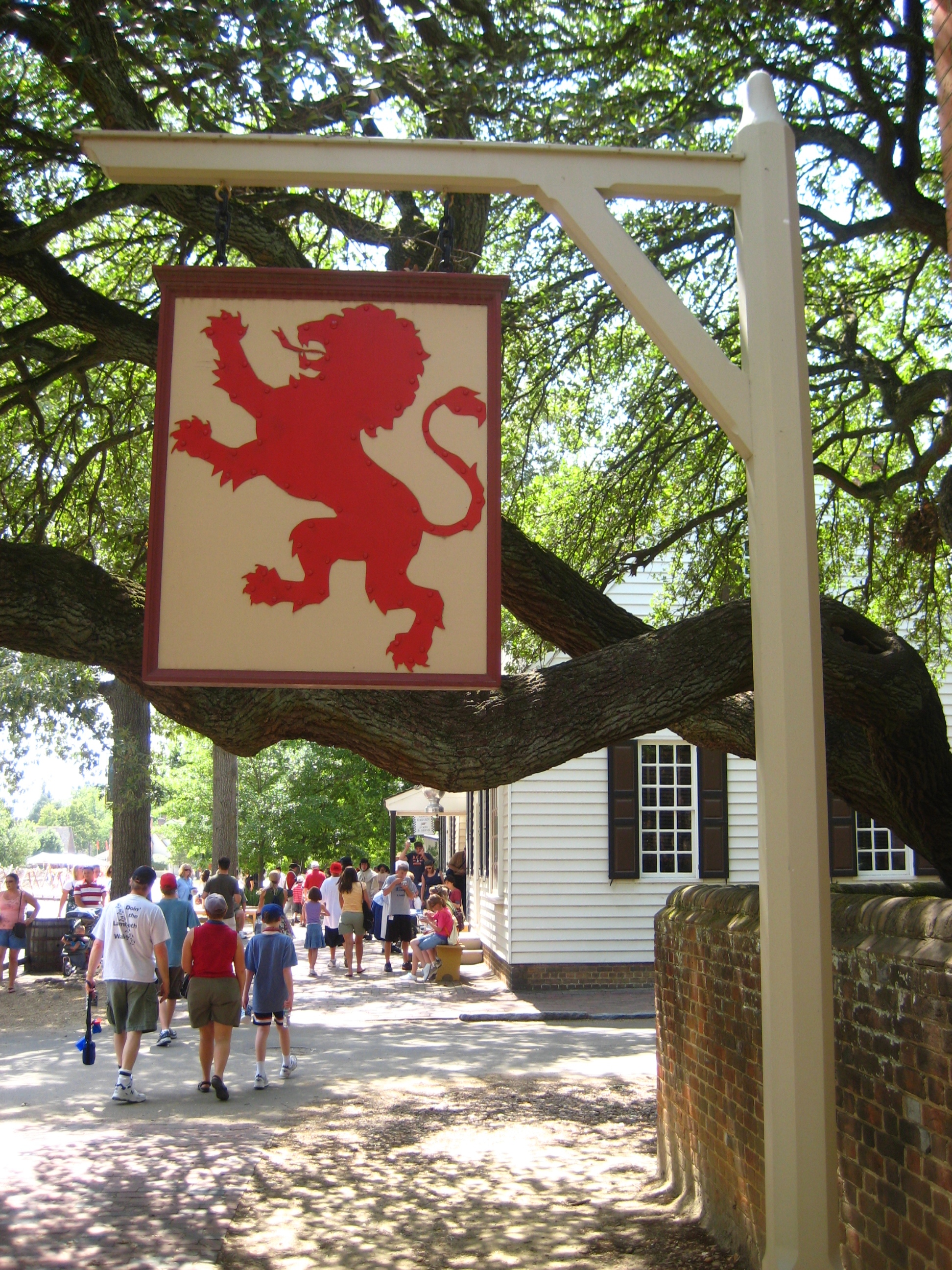
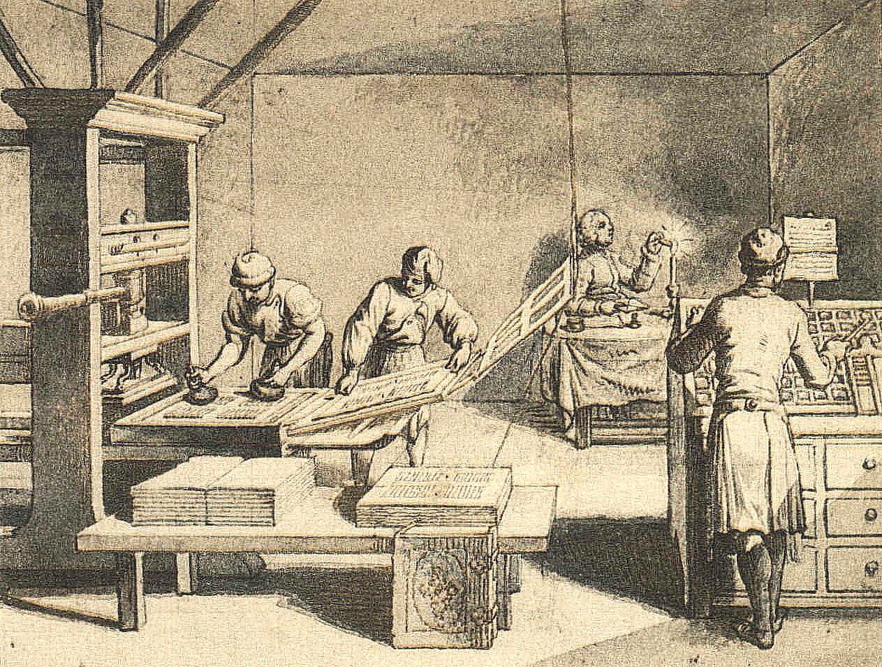
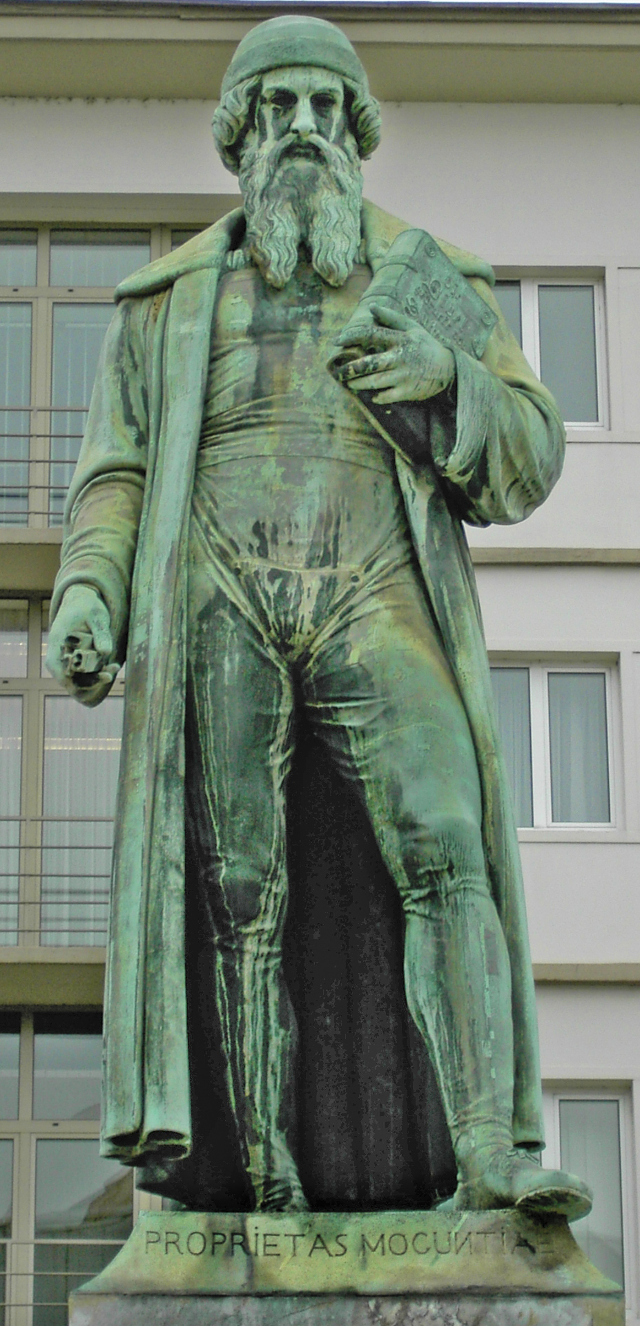
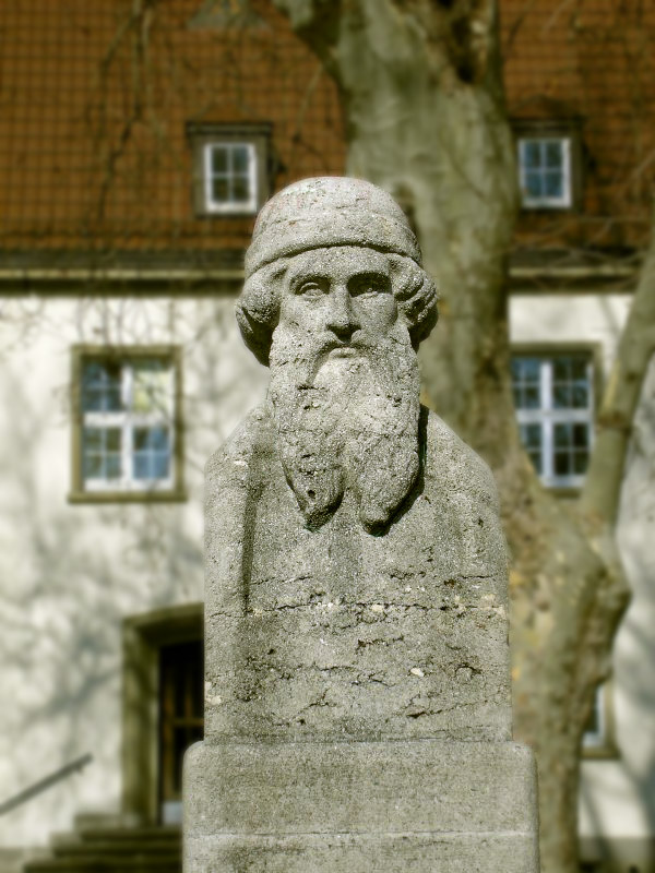
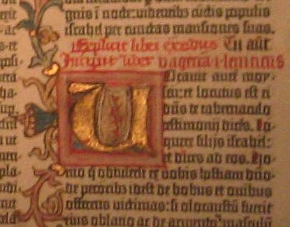
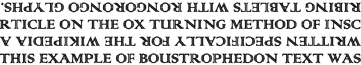
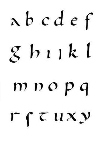
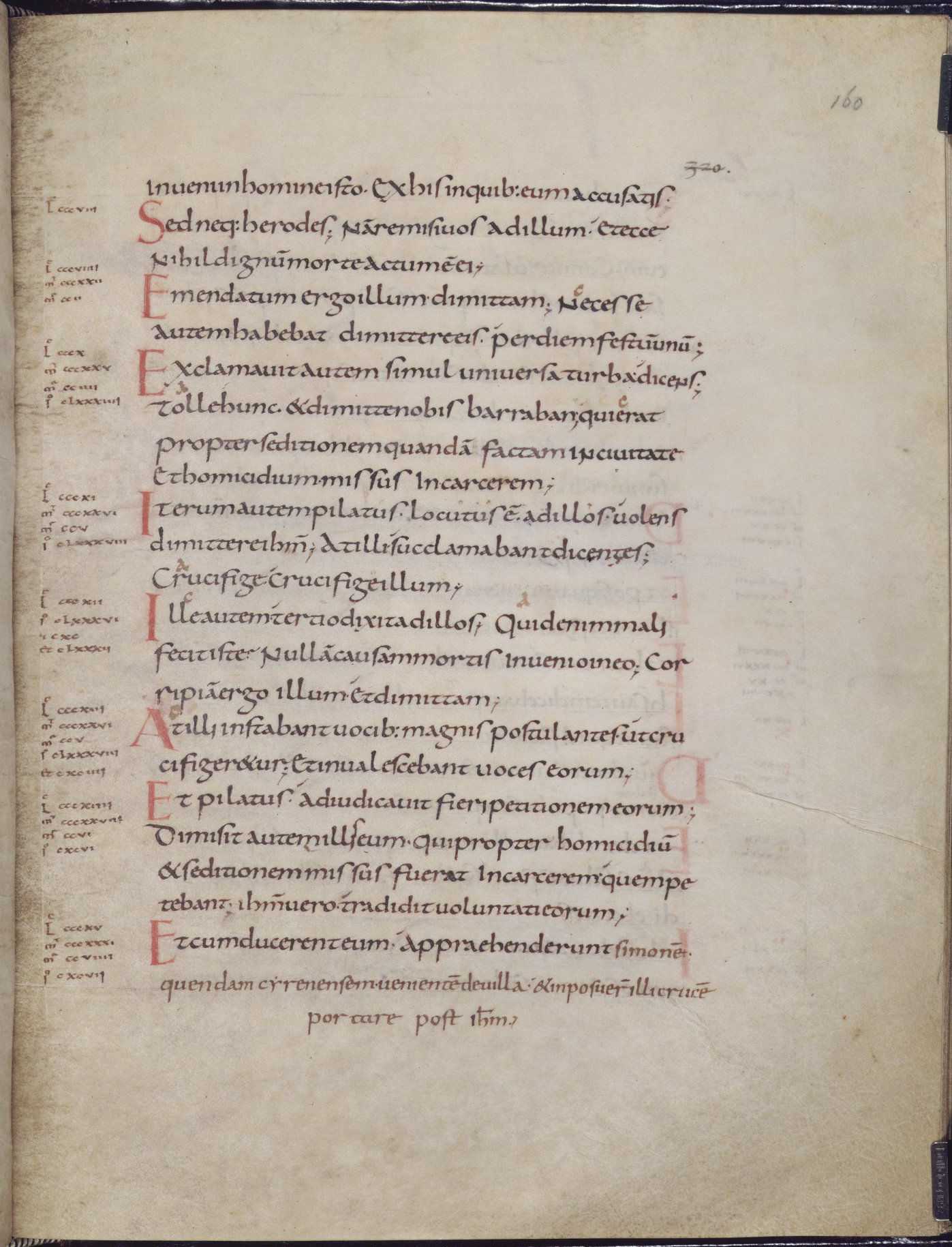
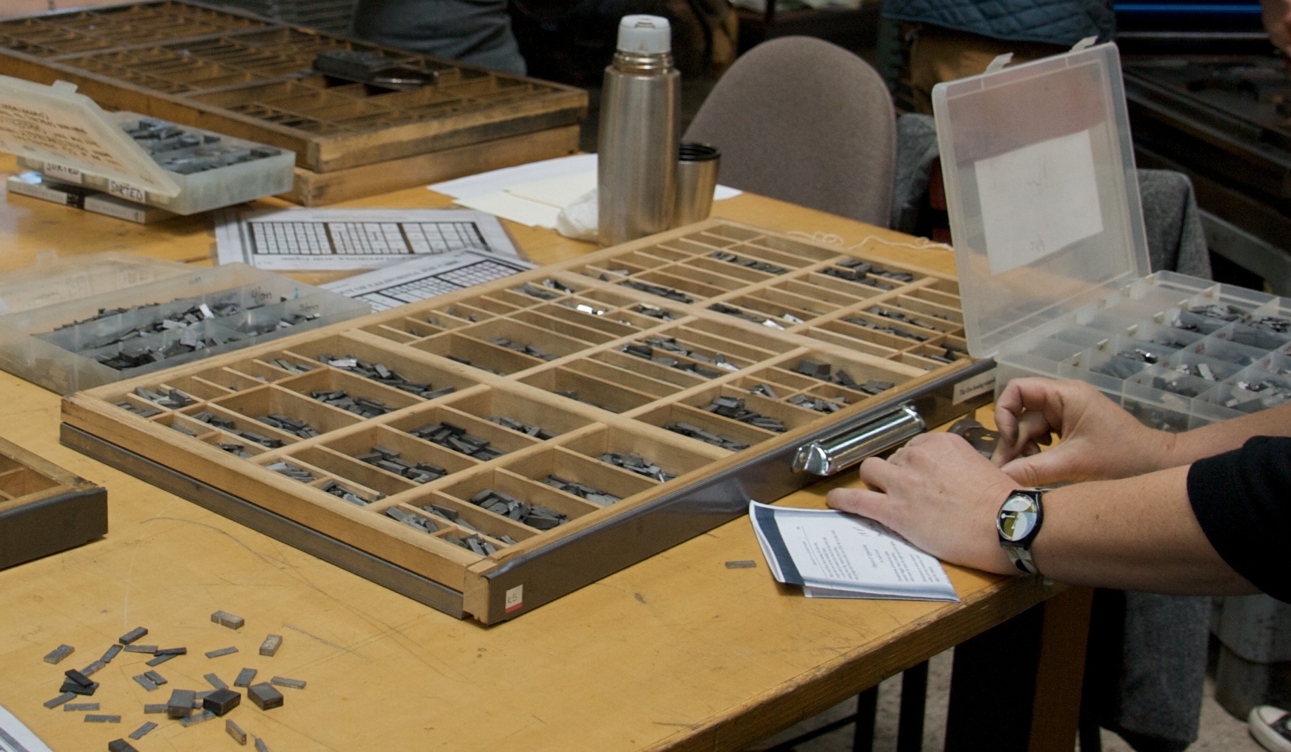
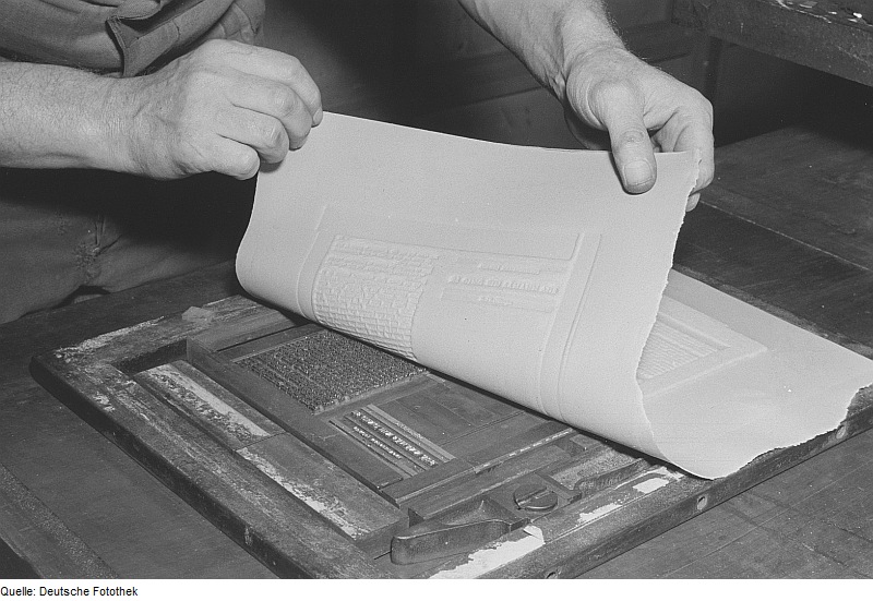
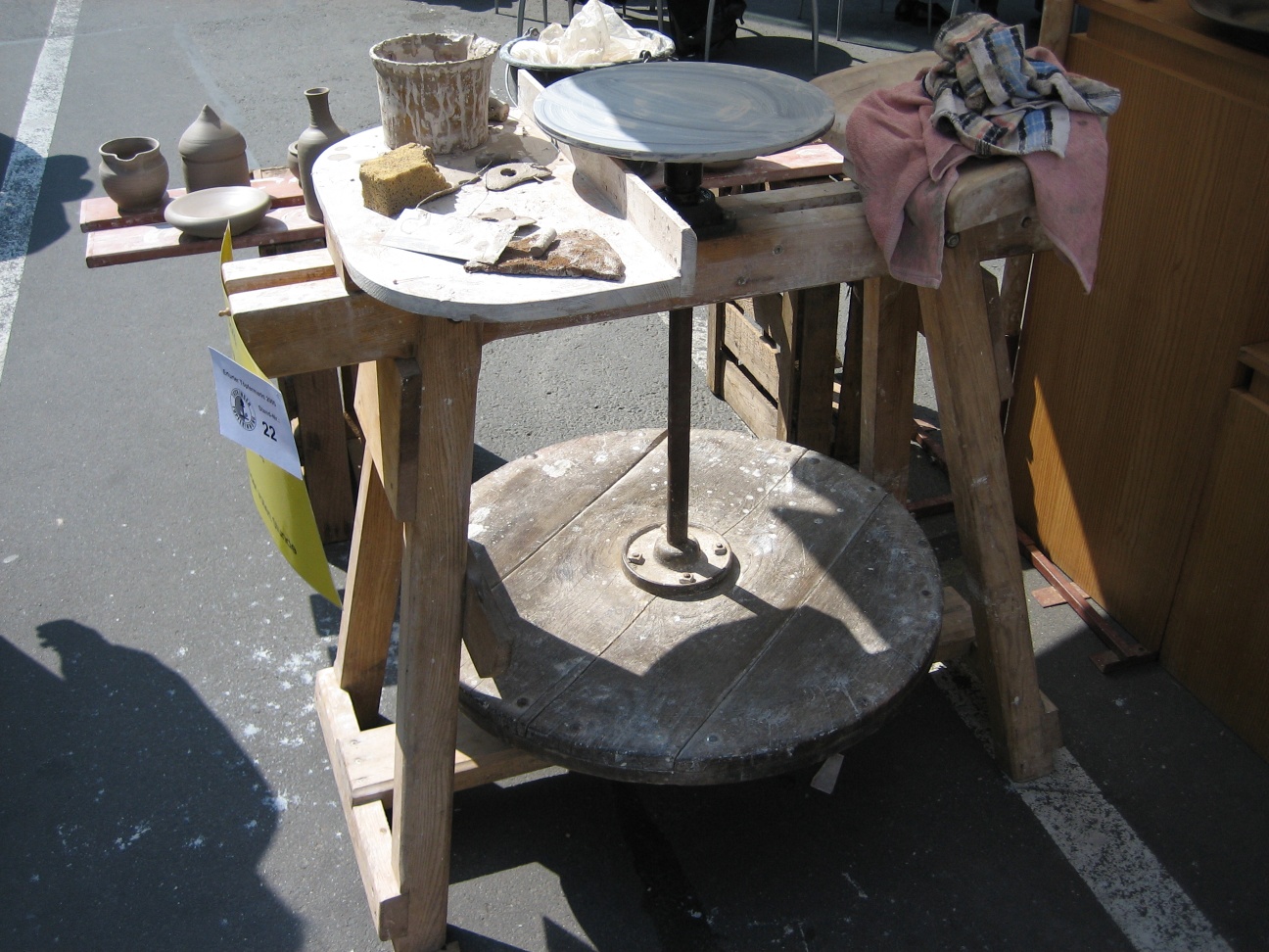