|
Reflections 2012
Series 5
May 10
Topic Selection - Nast & Santa Claus - Mauldin's Willie & Joe
| | Topic Selection I’ve gotten some short, but very pleasant comments on the last couple of postings, both from old and new friends. When I get complimentary comments, I always have to mention that I learn as I do this. I get a feeling that some readers might come to a conclusion that I’m fully informed in advance on topics I write about, and that’s not true. We all know certain bits and pieces about various subjects, and I know my share, but delving into the online research to expand the knowledge that we all learned in school is the exciting part for me. I usually find I’m expanding my knowledge in the months during planning, before any posting appears. And in this expansion, one topic I had known little about leads to another until the notes abound in preparation for the final write-up. | | | | For instance, in preparing for the previous posting, I learned the name of the Atlantic is related to Atlas. We’ve all heard of him, but who just was he? That led into checking out Titans and Olympians and some mythology, then to the Atlas Mountains. The subject of map books named atlases then squeezed its way in. With the mountains came the Pillars of Hercules, and from there came the information on the dollar sign. What I keep on discovering just never stops. Try to finish one thing and two more heads pop up. | | | | The basic parameters for the scope of this website are the topics of travel and language, but as one goes places, meets people, and learns things, all sorts of interesting subtopics pop up beyond the obvious geography and history (for travel) and language history and development. We’ve talked about art, films, theater, literature, math, sociology, and on and on. I’m interested in some of these topics much more than others, but it’s all part of the same expansion of life experience. | | | | I find a lot of the friends I’ve made over time are deeply into travel, and I’ve asked occasional advice. Some close friends are deeply into rail ‘n’ sail as well. As for language, a number of friends do actively use a second language, and some more than one, either to what I call Level A or Level B competence, but beyond that, no one I’ve so far met goes into what I call Level C competence. But see below. | | | | On occasion during the December holiday season, most recently in 2009 and 2011, there have been social functions I get involved with in New York and I do a special posting covering them. On other occasions, I’ve discussed social get-togethers within a trip as well. This April there were two social functions in New York I went to about which I want to mention topics and people. The topics include “Level C” languages, printing, and editorial cartooning.
| | | | Levels of Language Competence Having active use of a second language--or more than one--is a valuable ability, but talking ABOUT language and languages in general and specific languages in particular is often something else. | | | | I find that some people who have a second language can be parochial and territorial about it, but others are much more amenable to the reality of internationalism. Some people study a language because it’s their heritage language, whether they actually spoke it in the house or not. But it’s even more refreshing when someone picks a language (or two) that they have no personal connection with. I suppose what I like is language for language’s sake, even beyond language for heritage’s sake. | | | | I personally divide language competence into three levels. What I call Level A involves fluency. My level A languages (and Beverly’s) are three: German, Spanish, and French. What I call Level B competence involves ability below (sometimes far below) fluency, but still a working knowledge. The languages Beverly and I studied, either on our own or in summer schools abroad, are five: Italian, Dutch, Swedish, Portuguese, Russian. Reading the first four cause me little trouble. Writing them, a bit more, as shown by the Dutch email I recently sent friend Alex in Belgium. As for Russian, I’ve lost some of the little competency I once had, and can manage with it, but it’s become my weakest Level B language. | | | | What I call Level C is something quite different and involves its own kind of joy. It’s a level of competence that involves no competence at all. Instead, it’s an interest in languages you do not speak or read, and essentially know nothing about. In those cases, especially when traveling, you can look into them and find out just enough for fun to know, for instance, place names and how to say them. | | | | My “best” Level C language is Hawaiian. Ever since I picked up a thin book in the Queens College library on the subject I’ve had an interest in it. This Level C interest culminated in a rather extensive discussion of Hawaiian on my 2008 visit that ended up as an entire posting (2008/22). And I don’t speak a word of it, mahalo very much. | | | | In Finland (2006/9) we discussed a little of the Finnish we found on signs, including its sister language, Estonian. In 2009/30, we discussed the reformed Turkish alphabet, and the Korean writing system. In 2009/31, we discussed Chinese writing and in 2009/32 Japanese writing, with follow-ups in 2009/36-37. (Anyone who has not seen these should read them and see how easily they’ll recognize carefully selected Chinese and Japanese characters embedded in an English text.) The point is that you don’t need to know a language above Level C competence to look up what you might find as “fun stuff” and enjoy it, anytime, but particularly when traveling.
| | | | Roger Smith Hotel The above discussion is a lead-in to an event in mid-April that took place at the Roger Smith Hotel on Lexington Avenue in New York, a boutique hotel. While the Middlebury College New York Alumni always has its holiday party at a rather spectacular setting, most of the some 800 attendees are alumni of the undergraduate program, and there are rather few attendees of the graduate programs, which are all language-oriented. However, the alumni reception at the Roger Smith was exclusively for language students in the graduate programs, either summer language schools or the year abroad. Of the couple that own the Roger Smith, the wife had attended Middlebury’s year program in Madrid, as had her daughter, who was in attendance. There were about fifty attendees, and it’s possible it might become an annual affair. It was hosted by a college official I’ve mentioned in the past, Daniel Breen, the Director of Development, Graduate, and Special Programs. | | | | It was quite a pleasant evening, since everyone in the room had a language background. At one point, Dan asked everyone to introduce themselves and say a few words, and in some cases, it was their job today, or they just had studied it. Some had been in various of the Middlebury Summer Schools, or in Middlebury Schools abroad. I gave my Middlebury background (2011/23) and talked about this summer’s plans. Many were in teaching. One alumnus worked for the UN and was involved in hiring language people. | | | | I spoke to many interesting people. One couple, who really did look like lovebirds, was involved in the Moscow program and was engaged, so I went up afterwards to point out how Beverly and I got engaged in the Mainz program. But in many cases, there was still that parochialism, such as the Italian-American gentleman who had studied Italian at Middlebury and presently directed an Italian program at some institution. I admired his work, but it just seemed a bit inbred to me. | | | | But when I first got there that evening, and few had arrived yet, the very first person I met was talking to Dan Breen, and Dan introduced me to him. My first question to Allan was quite naturally what Middlebury school he’d attended. When he said he’d attended the German School my ears perked up, for obvious reasons. And there was no “heritage” connection with him, either. My ethnicity is half Russian, half Italian, and I chose German. Allan’s ethnicity is Chinese, and he chose German. This was a promising start.
It then got better when Allan said he’d attended a summer in Middlebury followed, as usual, by the year in Mainz, although about two decades after my first round of summers and three years after our second time around. Further conversation indicated Allan was indeed a “multi-languist”. We discussed his languages, and I was delighted to see his Level C interest as well. With the exception of Beverly, I’d never met a colleague before with an interest in the language field so similar to mine.
| | | | During further discussions that evening and in subsequent emails, I learned that he also spent time in Denmark two years ago and learned Danish as part of a government course. For the upcoming trip, I’d planned on discussing a few facts about Icelandic, particularly place names, and certain letters of the alphabet that I’d already mentioned in 2008/17, thorn and edh. I don’t know Icelandic, but that information is easy to figure out. Well, to supplement his interest in Danish, Allan started working on Icelandic when he visited there some time ago, picking it up from books and radio broadcasts, and we were able to compare notes. But it gets better.
| | | | I’m stopping in the Faroe Islands. Many people have never heard of them, and of those that do, most are unsure of where they are. Their population is small, and they speak Faroese, which is derived from Old Norse. In sum, when you’re speaking of the North Germanic (Scandinavian) languages, in addition to the more familiar Swedish, Norwegian (two varieties) and Danish, there is also Icelandic and Faroese. When I brought up a point about Faroese, about which I’m prepared to say next to nothing when I’m there, Allan pointed out that when he was in Denmark, he ordered a set of Faroese language textbooks with audio CD, and has worked with them. He also follows Faroese and Icelandic on the internet, and may want to enter the field of Nordic languages, just for fun. When he returned to New York from Denmark, he’d wanted to go via the Faroes, Iceland, and Halifax, but could not make it work, so he’s particularly interested in what I’ll be posting. Actually, aside from the fun of being able to compare notes (although with these two languages, he’s WAY above me), I’ll be able to use his expertise to check facts. | | | | When I wrote him about my posting on Hawaiian, he said he’d take a look, but also mentioned a couple of things he already knew about that language. In talking about Faroese, he made a cross reference to a Turkish letter, ğ, that I was familiar with from that writeup, expecting me to be aware of it. | | | | We got together for dinner before I left on the upcoming trip to compare further notes. It’s good to have Allan on this same language wavelength, including for that special in-depth interest in all those Level C languages out there. | | | | Social History Repeats Itself When I meet people traveling, it’s usually on an individual basis, but on one particular occasion, an entire table of people at dinner had such a wonderful bonding experience that it was memorable enough to document, which I did in 2006/15 “Day 2”. It was on the Explorer II on the Antarctica trip, and I was seated as the sixth at a table for six at which there were five Australians, two couples who had known each other since school days, Ruth & Neil and Janet & Peter, and John, traveling without his wife. We had such a wonderful time talking that the six of us have remained in touch ever since, sharing travel tips. Also, when I made it to Sydney, I was invited to Ruth & Neil’s for dinner (2010/19 “Wahroonga”), which included celebrating my birthday five days hence. The others were traveling and expressed their regrets for not being able to attend, but that evening, Janet & Peter phoned from their ship in an Icelandic fjord with birthday greetings. Call it a traveling dinner table success story. | | | | I thought an entire table couldn’t have as much fun until an evening four days after I met Allan. Two couples, Bruce & Pat from Saint Louis and Mike & Marian from Orlando, were visiting New York together and we all went to Orso for dinner, occupying a table for five. I’d met Bruce & Pat on the Amazon trip, where we were all on the same team for team trivia. Bruce and Mike had gone to school together in Saint Louis and both couples had known each other for years, so it was a matter of me getting to know the one couple better and meeting the other couple. Still, history repeated itself when the entire table had a wonderful time bonding. It was the good food and camaraderie, although Orso’s robust house red wine, a fabulous Primitivo from Puglia, in Italy’s heel, might have had something to do with it. | | | | [A full discussion of Orso appeared in 2007/1 “Minor Celebrity Spotting”, where I mentioned that Orso, in the Theater District, is known for its celebrities. As many times as I’ve gone there, though, the celebrities I mentioned on that posting were the only ones I’ve ever seen there: once, Mike Nichols two tables away, and another time, hitting the jackpot, with Lorne Michaels, Ron Silver, Richard Mazur, and Cybil Shepherd. However, on another visit with a friend a week after the one above, we asked the young waitress about celebrities, and she gushed that “every time” Angela Lansbury comes in for dinner the waitress melts into a puddle.] | | | | So what do these two couples with me at Orso have to do with interesting topics? Bruce’s field is printing and graphic design and Mike’s is editorial cartooning, both of which interest me, and which I’ll now follow up on. | | | | Printing In Brooklyn Tech one required shop course I reveled in was print shop, probably because of the language connection, since the topic of printing is an intersection of language and graphic art. I wrote up my experience extensively in 2005/17 as part of the story of Gutenberg and his invention of moveable type, which occurred in Mainz and where the university we studied at with Middlebury is the Johannes-Gutenberg-Universität. | | | | When I got to know Bruce on the Amazon trip and found out that his career in Saint Louis had been in printing and graphic design, it was again one of those rare cases where I found someone on the same wavelength on a favorite topic. Obviously, he’s way ahead of me, but still there was someone to discuss the topic with. Over the last year, lengthy, illustrated (!!!) emails flew between Saint Louis and New York discussing, for instance, fonts and typefaces, and a myriad of related things. | | | | For instance, we talked about the popular (relatively) new (1957) Swiss-designed sans-serif font Helvetica, which I knew because of its somewhat well-known use throughout the New York subway (click to enlarge). A distinctive feature of Helvetica is the square dots on lower-case I and J (check “Station” on the subway picture). Helvetica, among the most widely-used sans-serif typefaces, is also used extensively by the US and Canadian governments, many corporations, and internationally. Versions of Helvetica also exist for other alphabets and writing systems: Cyrillic, Greek, Hebrew, Japanese, Korean, Hindi, Urdu, Khmer (Cambodian), and Vietnamese. Chinese typefaces have also been developed to compliment Helvetica. | | | | But Bruce also introduced me to his favorite font, Garamond. I’d seen the name but knew little about it. It’s a serif font named after Claude Garamond (15C-16C). A distinctive feature of Garamond is the tiny openings in lower-case A and E. Garamond is considered to be one of the most legible serif typefaces in print applications. | | | | One affect that my emails last year with Bruce on the subject of printing had on the website followed Bruce’s bringing up the long S, as in “Congreſs” and “ess-tsett” as in German “Straße”. The results of that discussion have already appeared in the discussion of the Wayside Inn in 2011/22. | | | | Editorial Cartooning Another topic that has always interested me was editorial cartooning, those illustrations containing an often biting commentary on current events or personalities. In addition to artistic skill, it combines hyperbole with humor to make a point. It’s a topic that’s an intersection of art, journalism, and very frequently (but not always) politics. Good political cartoons are crucial aspect of contemporary graphic literature, to the point that elements of political cartoons can become part of the culture.
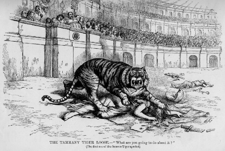
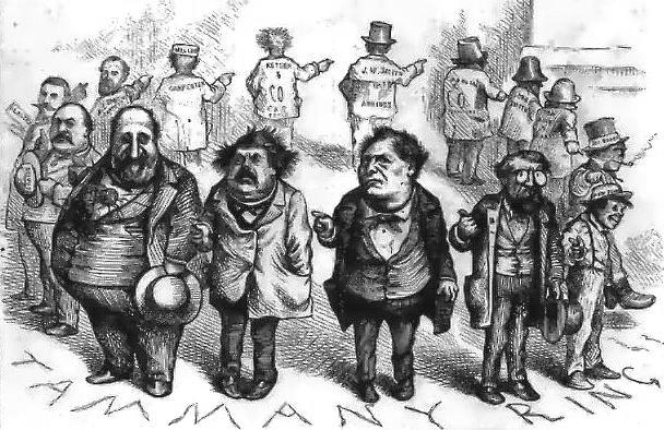
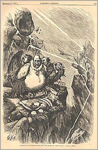
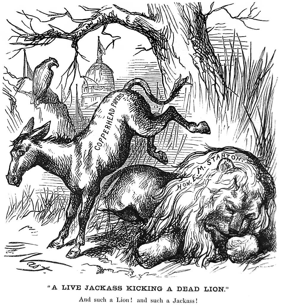
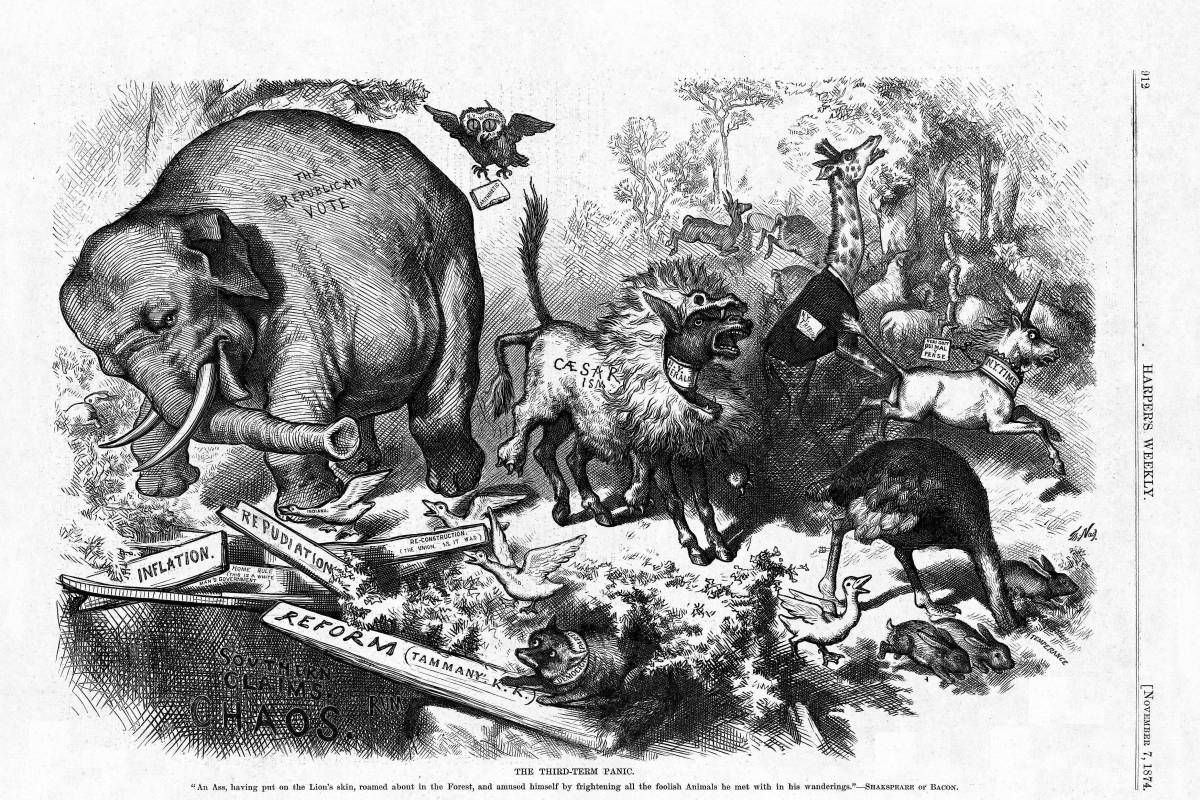
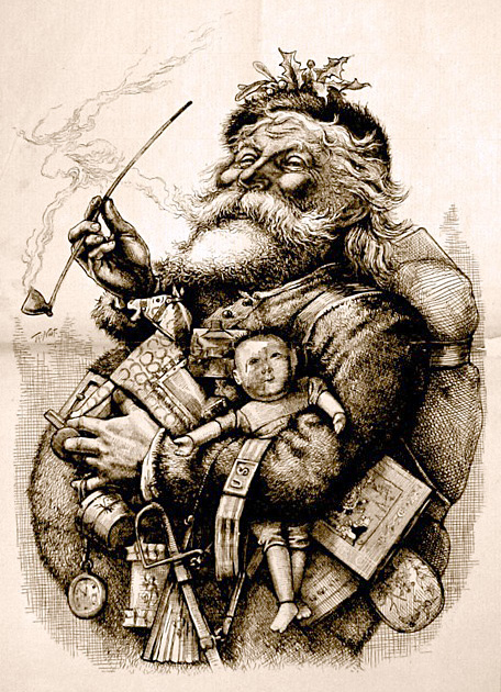
| | | | THOMAS NAST While the art form goes back at least to the 18C, the “father of modern American editorial cartoons” is the German-American Thomas Nast, who worked in the latter part of the 19C, a figure I would occasionally refer to in my German classes. Nast shared political views with his friend Mark Twain. Nast’s political cartoons in Harper’s Weekly starting in 1859 wielded great power, particularly in helping to publicize and dethrone “Boss” Tweed, the rotund political boss of the Tammany Hall political machine in New York, deeply involved in graft and corruption, particularly starting in 1869. | | | | To personify Tammany Hall and its influence, Nast devised the iconic image of the Tammany Tiger, depicted as killing democracy. He showed the Tweed Ring saying “Who stole the people’s money?--Twas him.”. The ring appeared as a group of vultures in Harper’s Weekly in 1871 with the clever punning caption “Let us prey.”. | | | | Tweed had been under attack for months from both the New York Times and Nast at Harper’s Weekly. Referring to Nast’s cartoons, Tweed reportedly said, “Stop them damned pictures. I don’t care so much what the papers say about me. My constituents don’t know how to read, but they can’t help seeing them damned pictures!” Tweed was tried, convicted of fraud, and jailed, but escaped and fled to Spain as a common seaman on a Spanish ship. The US alerted Spanish authorities, and Tweed was arrested on arrival in the port of Vigo and returned to jail in New York in 1876. On his entering Spain, the Spanish authorities recognized him from one of Nast’s political cartoons that they had been provided with. | | | | The Tammany Tiger and Boss Tweed are historic and just of Nast’s period, but Nast’s largest contribution to popular culture involves iconic characters that he did not invent, but revived, modified, and most importantly, popularized to the extent that they are usually associated with him to this day. | | | | Uncle Sam The image of Uncle Sam as the male personification of the US government (or of the American people) goes back to the War of 1812. Nast’s Civil War era lanky version added the iconic goatee, and was loosely based on Abraham Lincoln’s lanky appearance. It was the basis for what we see today. | | | | Columbia The image of Columbia, a Greek goddess as the female personification of the Americas, goes back to the American Revolution. It followed the pattern of France’s Marianne and Britain’s Britannia. This Columbia was popular until the War of 1812, when its use died out. Nast revived Columbia with his drawings of an attractive, vigorous young woman. | | | | Democratic Party Donkey Andrew Jackson’s opponents had labeled him a jackass in 1828, and in 1837, an early political cartoon was published of Jackson riding a donkey, which represented Jackson’s Democratic Party, but this imagery did not last. Once again it was Nast who revived the image, by publishing in 1870 in Harper’s Weekly this political cartoon showing a donkey. Although the donkey is not labeled “Democrat”, the Copperheads were a vocal group of Northern Democrats opposed to the Civil War. This cartoon revived the donkey as a symbol for the Democratic Party, and other cartoonists followed his lead. Modern images such as this stylized donkey hark back to Nast’s lead. | | | | Republican Party Elephant Four years later, in 1874, Nast published in Harper’s Weekly this image of an elephant, this time clearly labeled Republican. One could surmise he might have chosen an elephant, for this drawing at least, because of its overwhelming size as compared to the other animals shown. This is the first notable appearance of an elephant as such, and is the precursor of modern images such as this stylized elephant. | | | | Santa Claus Not all editorial cartooning is political, and it may surprise that among Thomas Nast’s notable contributions is his part in the creation of the modern version of the secular, folkloric image of Santa Claus. I’ve always been particularly interested in the Dutch heritage of New Amsterdam and the Hudson Valley, which included the early importation of Sinterklaas (Sint Nikolaas)to North America. He was depicted, not in today’s image, but as a tall, thin, white-bearded bishop. If you are familiar with stories of shoes being filled with goodies or with coal, and of a figure entering town on horseback, you are thinking of the earlier versions of the Saint Nicholas legend, still popular in Dutch-speaking and German-speaking parts of Europe. | | | | While the above is the basis for the modern image of Santa Claus, imported to North America by the Dutch in New Netherland, the contemporary image has become secular and has developed unique characteristics over the last two centuries. He is now only rarely referred to as Saint Nicholas or Saint Nick--ask any child. From the 19C on, new versions and images evolved to become a Santa Claus that is a secular holiday image (you won’t find him standing next to a shepherd in a nativity scene), and one that is, unfortunately, rather commercialized. This figure is associated with flying, a sleigh, eight reindeer, chimneys, the North Pole, and all those newly-developed characteristics. This newer image is not only an American creation, I’m thoroughly surprised to have to say it’s a New York invention, because I now find that at least three well-known figures, Irving, Moore, and Nast, all New Yorkers, were instrumental in consciously developing the figure into the image we now recognize. The figure has also become an example of the globalization and Americanization of this folkloric, holiday image. | | | | I’ve found an early reference to the beginnings of change in this image from Washington Irving (“The Legend of Sleepy Hollow”; “Rip Van Winkle”), who lived at his estate, Sunnyside, in Tarrytown in the Hudson Valley. In 1809, under the pseudonym Diedrich Knickerbocker, he wrote the satirical “A History of New York”, which included several references to legends of Saint Nicholas. In one, there was a dream in which “. . . the good St Nicholas came riding over the tops of the trees, in that self-same wagon wherein he brings his yearly presents to children, and he descended . . . . And he lit his pipe by the fire, and sat himself down and smoked . . . . And when St Nicholas had smoked his pipe, he twisted it in his hatband, and laying his finger beside his nose, gave the astonished Van Kortlandt a very significant look; then, mounting his wagon, he returned over the tree-tops and disappeared.” This is the beginning of a transition from an earthbound bishop towards the modern image, but we note that, while he now magically flew, he used a wagon, and it was not specified if any unusual animals pulled it, so we might assume horses. There’s no reason not to assume his landing was on the ground, and that he entered the house by normal means. He has already become a pipe smoker. | | | | In 1823, Clement Clarke Moore wrote “A Visit from Saint Nicholas”, which later became more famous by its first line “Twas the Night Before Christmas”. He lived on the west side of Manhattan, in the open countryside north of Greenwich Village, on an estate he’d named Chelsea after the London hospital. As New York grew and streets expanded, his estate became today’s Chelsea neighborhood. | | | | I’d always considered Moore’s Chelsea poem as a reflection of established, contemporary legend, and am now surprised to find that he was actually CREATING much of that legend by this very poem. It was more major an alteration of the Santa Claus story than Irving’s. St Nicholas day is 6 December, and in Moore’s time, New Year’s Day was perhaps a bigger holiday than Christmas Day. Moore moved the time of the visit away from all those days to Christmas Eve. The mode of transportation was now not a wagon, but a sleigh, and Moore introduced the landing on the roof, the reindeer, including their number and names, and entering via the chimney. Curiously, he repeated--but varied--one of Irving’s phrases as “And laying his finger aside of his nose . . .” | | | | But Moore described his figure as a “jolly old elf”, a description that always seems odd today, since the image has since developed further. In addition to that, the phrases that Moore uses, “miniature sleigh”, “eight tiny reindeer”, and “little old driver”, indicate that his figure is physically rather diminutive, actually rather elfin, contrary to today’s image of a full-sized figure. Additional descriptions were meager. His body was “dressed all in fur” and was “chubby and plump”. His face had twinkling eyes, dimples, red cheeks, and a white beard, and he was smoking that pipe again. Beyond that, no visual image was provided with the unillustrated poem. | | | | It was forty years later, in 1863 during the Civil War, that Thomas Nast began extending and embellishing Moore’s image. The first appearance of Nast’s Santa Claus was on the cover of Harper’s Weekly (click to enlarge). It was called “Santa in Camp”, and had a patriotic-military theme, since Santa was dressed in the Stars and Stripes, was distributing gifts to Union soldiers, and was holding a puppet labeled “Jeff” for Jefferson Davis, President of the Confederacy. Santa Claus is here a full-sized adult person, not an elfin creature. | | | | Over the next two decades, from 1863 to 1886, Nast regularly did Christmas drawings for Harper’s Weekly in which Moore’s pudgy, diminutive, elf-like creature developed even further into the portly full-sized image of today. This is his 1881 Santa Claus, still retaining that pipe. But as Moore had embellished details of the legend, so did Nast. It was Nast who established Santa’s workshop and official residence at the North Pole over four different drawings. One, in 1879, called “A Christmas Post”, showed a girl putting into a mailbox a letter addressed to the North Pole. Another, in 1885, showed a map of “Santa Claus’s Route” from the North Pole. In color illustrations in a book, Nast showed the red and white suit. Drawings also showed Santa reviewing his list of good and bad children. All these images became incorporated into the Santa Claus lore, which has spread around the world. Although further embellishments of the Santa Claus image developed during the 20C, much was already set by Nast in the end of the 19C. | | | | It was only in writing this summary that it struck me: I had known earlier that the Dutch imported the original imagery, but now I see that ALL the details of the modern cultural image of Santa Claus grew in New York, from the original Dutch legend in New York City and the Hudson Valley, to Irving in Tarrytown (Westchester County), to Moore in Chelsea (Manhattan), to Nast, who was also a Manhattanite. Santa Claus is a New Yorker, born and bred. | | | | BILL MAULDIN Editorial cartooning has produced many talented people since Nast. I’ll only mention three I know something about. First, people who’s reviewed World War II will probably have come across Bill Mauldin’s two characters, Willie and Joe, the personification of weary and bedraggled American soldiers, stoically enduring the adversities of war. Mauldin served himself in the army and knew the life firsthand. Here is a link to a website with a selection of nine Willie and Joe cartoons. | | | | The captionless next-to-last cartoon was Mauldin’s favorite. But it was the last one in that series that won “Sergeant” Mauldin the 1945 Pulitzer Prize for Editorial Cartooning “for distinguished service as a cartoonist”, as exemplified by that cartoon. He was 23. | | | | Old-school spit-and-polish army officers had been offended by the reality of Mauldin’s Willy and Joe cartoons. General Patton threatened to throw Mauldin in jail for “spreading dissent”. But General Eisenhower came to Mauldin’s defense on the basis that the cartoons were a good outlet for soldiers’ frustrations. By the end of the war, Mauldin was awarded the Army’s Legion of Merit. On June 18, 1945, “Mauldin’s ‘Willie’” appeared on the cover of Time Magazine, and on July 21, 1961, so did “Cartoonist Bill Mauldin”. | | | | Two years before the second Time cover, Mauldin had won the 1959 Pulitzer Prize for Editorial Cartooning, his second, for the cartoon depicting “Doctor Zhivago” author Boris Pasternak in a Soviet GULAG saying to another prisoner “I won the Nobel Prize for literature. What was your crime?” | | | | Probably the most famous single cartoon Mauldin ever published was the Lincoln cartoon, following the Kennedy assassination.
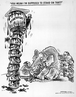
| | | | When he died in 2003, Mauldin was buried among the GIs he’d championed at Arlington. It was noted that “A cold and steady rain has been falling today for the burial of cartoonist Bill Mauldin at Arlington National Cemetery. Willie and Joe, Mauldin's perpetually cold and often wet World War Two infantrymen, would not have been surprised.” | | | | Almost every Veterans Day (17 times, actually) over the three decades from 1969 to 1998, cartoonist Charles M Schulz, himself a veteran of WWII, regularly paid tribute in his “Peanuts” comic strip to Mauldin by having Snoopy, dressed as the WWI flying ace, go to Mauldin’s house to “quaff a few root beers and tell war stories.” | | | | In 2010, the US Post office issued a first-class, 44-cent postage stamp honoring Mauldin, shown with Willie and Joe. | | | | HERB BLOCK (HERBLOCK) A cartoonist whose work I remember seeing frequently over the years was Herb Block, who signed himself as Herblock. He won no fewer than three Pulitzer Prizes for Editorial Cartooning, the first in 1942. His second was in 1954, for a cartoon depicting the robed figure of Death saying to Stalin after he died “You Were Always a Great Friend of Mine, Joseph.” His third one was in 1979 “for the body of his work”, essentially a lifetime achievement award. | | | | Herblock is responsible for adding a word to the language. In 1950 he published this editorial cartoon in which he coined the word “McCarthyism”. (Note the depiction of Nast’s Republican elephant.) | | | | MIKE PETERS Mike Peters is a nationally known editorial cartoonist. He is also the Mike of the “Mike & Marian” dining with Bruce & Pat and me at Orso’s. I’d discussed printing extensively with Bruce over the last year, and this was a chance to get to know Mike’s field better, both in discussions that night, and in research before and since. | | | | Mike won the Pulitzer Prize for Editorial Cartooning in 1981. In 2011, he won the Overseas Press Club’s Thomas Nast Award (!!!) for his body of work in 2010. In 2011 he also won the National Headliner Award for Editorial Cartooning, also for his body of work in 2010. | | | | In our conversations at dinner, I discussed my interest in the subject, mentioning Nast, Mauldin, and others. Mike mentioned that Bill Mauldin was his mentor, and Mike’s biography adds that Mauldin helped him find his cartooning position in the Dayton Daily News in 1969. In 1972, his cartoons became syndicated nationally and now appear in over 400 newspapers nationwide. His popular comic strip “Mother Goose and Grimm” dates from 1984 and is syndicated in over 800 papers worldwide.
| | | | He mentioned at dinner he was “semi-retired” from editorial cartooning, and his website clarifies that, in addition to seven comic strips a week, he’s reduced the editorial cartooning from five a week to two. | | | | There are a number of YouTube videos of Mike on various TV shows, but I strongly recommend you watch this one, even if it does run to 8:53, since it’s a good (and humorous) introduction to Mike Peters, and serves as something of a bio. The high school he talks about is the one where Bruce and he got to know each other. If you couldn’t tell, those were drawings of Amy Carter and President Jimmy Carter. | | | | This video is shorter, only 4:55. In it, Lesley Stahl of “60 Minutes” is at the Overseas Press Club and introduces Mike for a cartoon presentation when he got the Thomas Nast Award. | | | | Finally, you should look at the Mike Peters website. Click on the left arrow to look at previous cartoons of Grimm, but then click at the top on Editorials and then Editorial Archives, to review the editorial cartoons. Finally, under Editorials again, click on Farewells for cartoons of departed celebrities. | | | | An Appropriate Souvenir We were all having such a nice time at the dinner at Orso’s. Maybe that’s what gave me the impetus for a request, aided by further glasses of Primitivo. I just felt I wanted a memento of the occasion, and I suddenly heard myself asking Mike for one of his drawings. It could be anything, I said, and since they’d all traveled to New York, I suggested maybe Mike draw the best thing he’d found in New York. I pictured maybe a skyline, Times Square, a show they’d seen. I even considered he might draw the five of us sitting at that round table at Orso’s, deep in conversation.
| | | | Mike, who was sitting across from me, called over a waiter and asked for paper and pen. The waiter brought a copy of Orso’s dessert menu, which is printed on a regular sheet of paper. Mike flipped it over, turned it sideways, and started drawing. I got involved in another conversation. | | | | He was done quickly, and I was wondering what he’d decided on. I thought a strong possibility might be the five of us at the table. I was close, but not quite right. | | | | What Mike had drawn was a caricature of me, a head-and-shoulders right profile. As he said in his video, a caricaturist exaggerates unusual features that stand out. He got the nose, the glasses, the (very) high brow, the pony tail resting on my dark sweater. Fortunately, to fit the occasion, he also got a very large smile. He signed it below in the capital letters many cartoonists prefer, and to the right, also added an inscription, again in cartoonist’s capitals: | | | | | | VINCENT
IS THE BEST
THING I FOUND
IN NEW YORK
|
| | | | It was rather overwhelming, but he insisted it was the case. Still, I’ll take it as a commentary on the good time all five of us were having at dinner that pleasant evening. | | | |
| |
|
|
|

